Master Data Visualization Software: A Step-by-Step Guide for Analysts

Master Data Visualization Software: A Step-by-Step Guide for Analysts
Overview
The primary objective of this article is to serve as a comprehensive guide for analysts seeking to master data visualization software. It underscores the significance of such tools in market research and outlines the key features to consider when making a selection. Effective data visualization not only enhances comprehension but also improves communication and decision-making processes. This article details essential software features, including:
- user-friendliness
- integration capabilities
- customization options
These features collectively facilitate superior analysis and insights. By understanding these elements, analysts can make informed choices that elevate their data-driven strategies.
Introduction
The ability to transform raw data into compelling visual narratives represents a significant advancement in market research. Data visualization software enhances comprehension and communication, empowering analysts to uncover trends and insights that drive strategic decisions.
As organizations increasingly rely on data-driven strategies, a crucial challenge arises: how can analysts effectively select and utilize the right tools to maximize the impact of their findings? This guide explores essential features, evaluation methods, and troubleshooting strategies for mastering data visualization software.
By doing so, it ensures that analysts can navigate the complexities of data representation with confidence and clarity.
Understand Data Visualization and Its Importance in Market Research
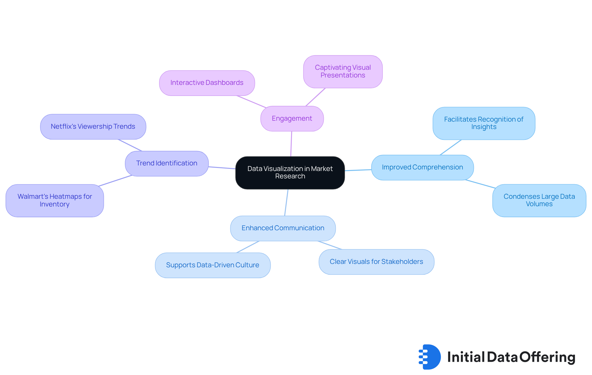
Information representation is the graphical depiction of insights and statistics. By utilizing visual components such as charts, graphs, and maps, data visualization software provides an approachable method to observe and comprehend trends, outliers, and patterns in information. In market research, effective data visualization is essential for several reasons:
- Improved Comprehension: Visuals assist analysts and stakeholders in swiftly understanding intricate information sets, facilitating the recognition of essential insights that influence strategic choices.
- Enhanced Communication: Well-crafted visual representations created with data visualization software can transmit messages more effectively than unprocessed information, fostering improved discussions and decision-making. As Paul Ross emphasizes, utilizing the appropriate graphics makes information more accessible and assists in establishing clear objectives by defining key performance indicators.
- Trend Identification: Analysts can identify trends and anomalies using data visualization software, which may not be readily apparent in numerical information, allowing for timely strategic adjustments. For instance, Walmart employs on dashboards to indicate inventory levels in different regions, enabling precise inventory management and boosting customer satisfaction.
- Engagement: Data visualization software often presents visual information in a more captivating way, capturing the attention of stakeholders and promoting interaction with the content. Companies like Netflix leverage interactive dashboards to analyze viewership trends, guiding programming decisions and enhancing viewer engagement and satisfaction. This practice has demonstrated that high-performing organizations are three times more likely to indicate that analytics initiatives contribute at least 20% to their earnings before interest and taxes.
In summary, mastering data visualization software for information representation is not merely a technical ability; it is a vital element of effective market research that can significantly impact business strategies and results. With merely 20% to 25% of entrepreneurs indicating access to all the information necessary for decision-making, effective representation of information becomes crucial in addressing these accessibility challenges.

Identify Key Features to Look for in Data Visualization Software
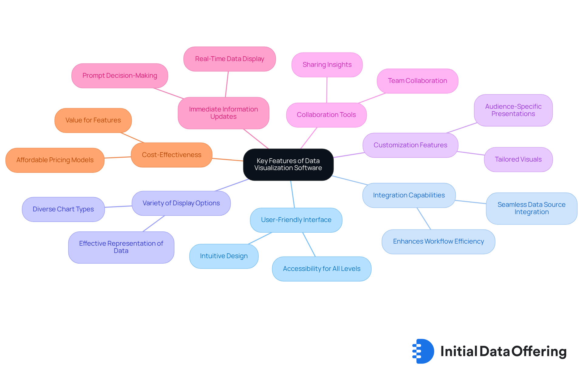
When selecting data visualization software, analysts should prioritize the following key features:
- User-Friendly Interface: A clean, intuitive interface allows users to generate representations without extensive training, fostering quicker adoption and productivity. Data visualization software like Power BI and Tableau are recognized for their user-friendly designs, making them accessible for users at all levels.
- Integration Capabilities: The software should seamlessly integrate with existing data sources, such as databases, spreadsheets, and APIs. This streamlines the data import process and enhances workflow efficiency, enabling analysts to focus on insights rather than data management.
- : Seek tools that provide a diverse range of display types, including bar charts, line graphs, and heat maps. This variety is essential for effectively representing various datasets and deepening understanding across different contexts.
- Customization Features: The ability to customize visuals—such as colors, labels, and layouts—is crucial. This flexibility allows analysts to tailor presentations to specific audiences, thereby enhancing communication and engagement.
- Collaboration Tools: Features that facilitate sharing and collaboration among team members can significantly enhance the analytical process. By promoting teamwork and collective insights, these tools contribute to more robust decision-making.
- Immediate Information Updates: In dynamic settings, real-time information display capabilities enable analysts to make prompt decisions based on the most recent insights. This is essential for sustaining a competitive advantage in fast-paced environments.
- Cost-Effectiveness: Evaluate the pricing model to ensure it fits within budget constraints while providing the necessary features. For instance, Power BI pricing starts at $9.99/month, making it an affordable option for many organizations.
By focusing on these features, analysts can select data visualization software that meets their current needs and scales with their future requirements. This ultimately enhances their data-driven decision-making capabilities. As noted by Veritis, "these resources assist companies in swiftly recognizing trends, monitoring KPIs, and making data-informed choices." Moreover, with more than 70% of companies anticipated to adopt information representation solutions in 2025, the significance of choosing the appropriate software cannot be emphasized enough.

Evaluate and Compare Data Visualization Tools for Your Needs
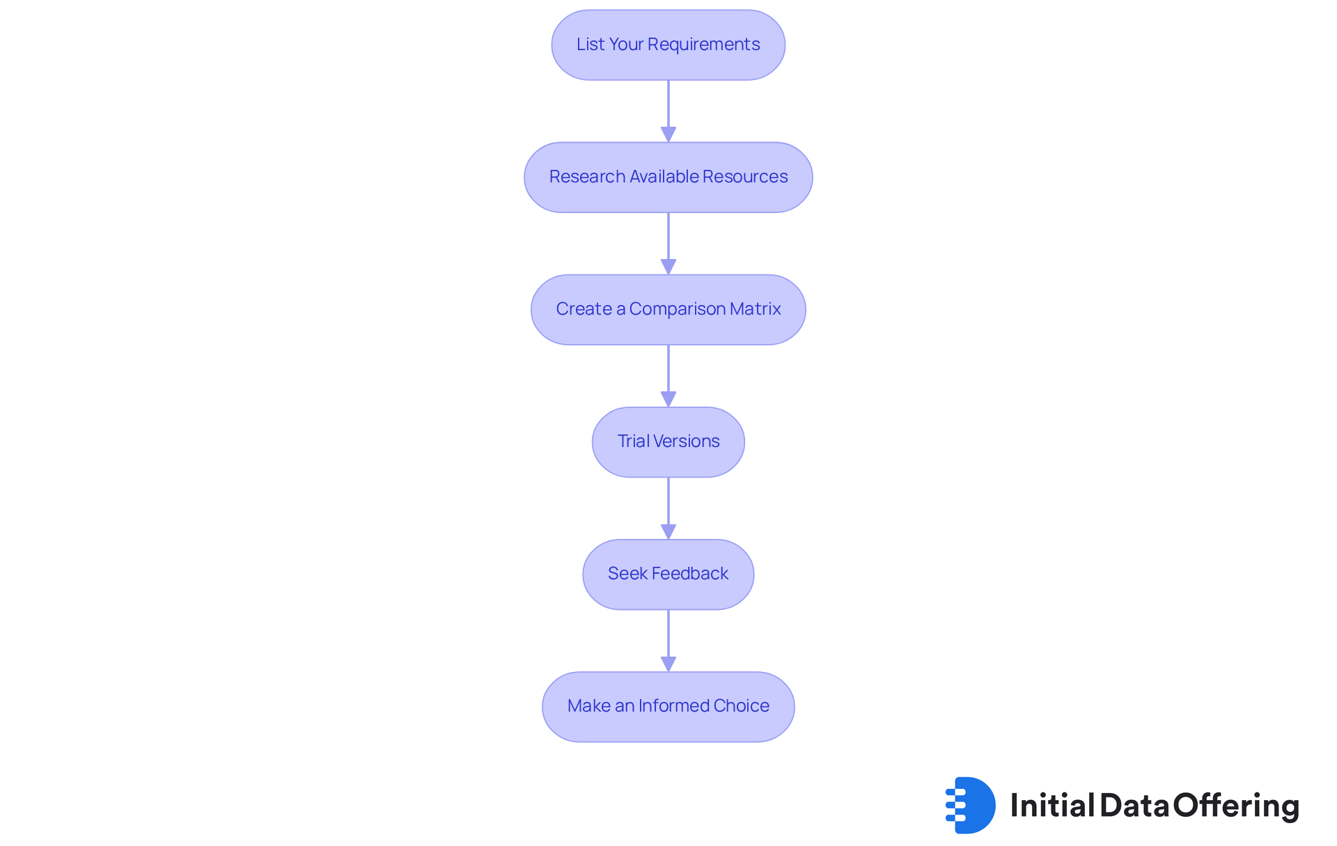
To effectively evaluate and compare data visualization tools, follow these steps:
- List Your Requirements: Begin by detailing your specific needs, including the types of information you manage, the complexity of graphics required, and your budget constraints.
- Research Available Resources: Leverage online materials, reviews, and user testimonials to compile a list of potential options that align with your criteria. In 2025, popular data visualization software tools include Tableau, Microsoft Power BI, and Google Looker Studio, known for their robust features and user satisfaction, with over 70% of enterprises adopting analytical solutions this year.
- Create a Comparison Matrix: Construct a matrix to compare features, pricing, user reviews, and integration capabilities of each tool side by side. This visual representation aids in identifying strengths and weaknesses, facilitating informed decisions.
- Trial Versions: Take advantage of or demo versions to test the software in real-world scenarios. Focus on usability and the quality of visualizations produced, as user experience is crucial for effective analysis. Remember, data visualization software can also categorize and analyze text data to uncover themes and sentiments, providing deeper insights into qualitative information.
- Seek Feedback: Engage with colleagues or industry peers who have experience with the tools you are considering. Their insights can offer valuable perspectives, particularly regarding user satisfaction and practical applications.
- Make an Informed Choice: Based on your evaluations, select the tool that best meets your requirements, ensuring it offers the features and support necessary for your data representation tasks. Additionally, assess the integration capabilities of the tools with various data sources, as this is essential for comprehensive analysis.
By systematically evaluating and comparing tools, analysts can confidently choose the right software to enhance their data representation efforts, ultimately leading to more informed, insight-driven decisions.

Troubleshoot Common Issues in Data Visualization for Market Research
Data representation presents various challenges that can hinder effective communication of insights. Understanding these challenges is crucial for enhancing the clarity of data visualization software. Here are common issues and strategies to troubleshoot them:
-
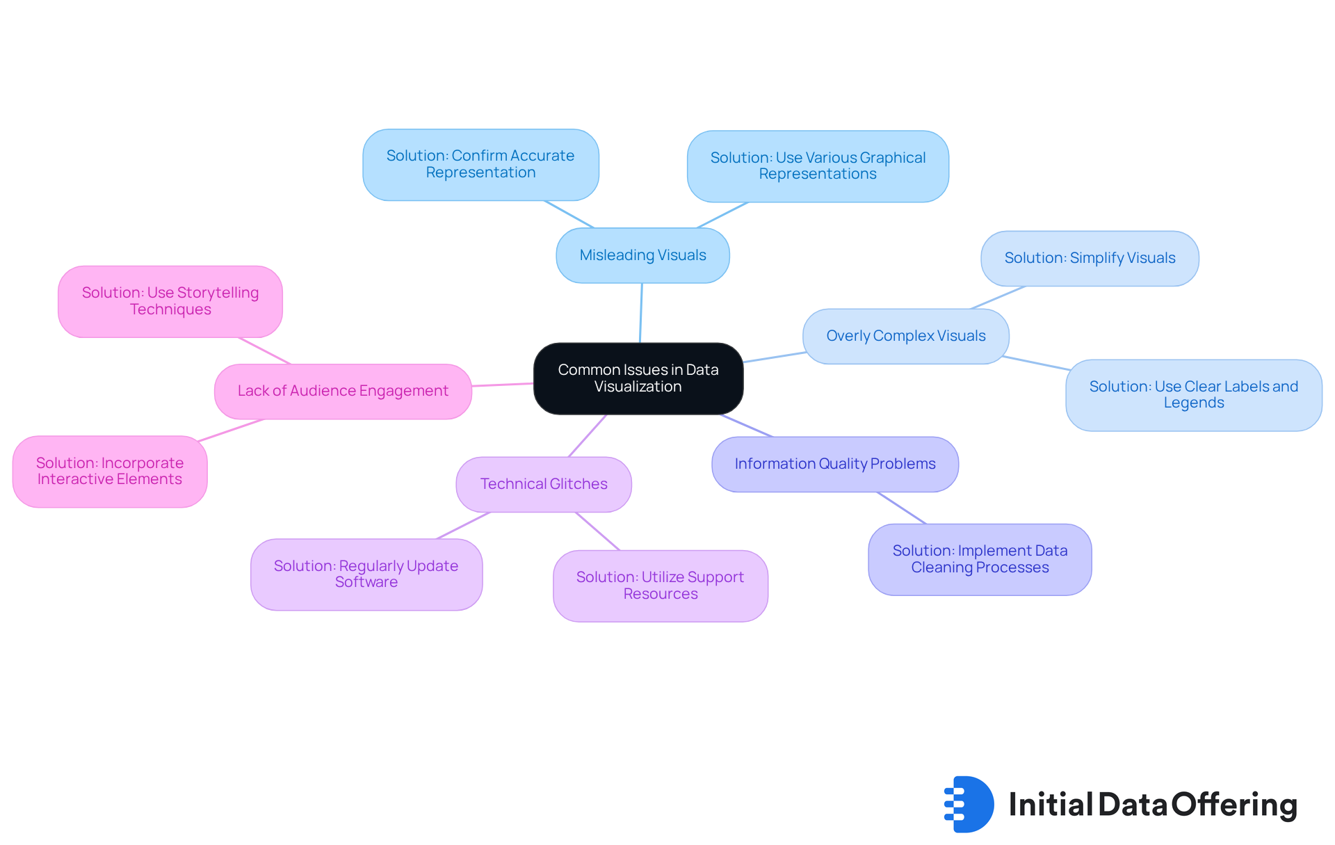
Misleading Visuals: Visualizations must accurately depict the information to avoid misinterpretation. Distorted scales or inappropriate chart types can lead to confusion. For instance, a CNN graph from 2005 misrepresented political party support by not starting the y-axis at zero, exaggerating the difference in support among parties.
- Solution: Always confirm that the graphical representation corresponds with the information. Consider using various graphical representations to convey the same information clearly.
-
Overly Complex Visuals: Complicated charts can overwhelm viewers, obscuring the intended message. Simplifying visuals is essential for effective communication.
- Solution: Simplify visuals by focusing on essential information and utilizing clear labels and legends to enhance understanding.
-
Information Quality Problems: Incorrect or low-quality information can lead to deceptive representations, impacting decision-making. Statistics suggest that can result in considerable misinterpretations in market research.
- Solution: Implement rigorous data cleaning processes prior to displaying the data to ensure the accuracy and reliability of the information presented.
-
Technical Glitches: Software bugs or compatibility issues can disrupt the display process, leading to frustration. Regular maintenance of tools is vital for smooth operation.
- Solution: Regularly update charting software and utilize support resources or forums for troubleshooting assistance when issues arise.
-
Lack of Audience Engagement: If visuals do not engage the audience, the core message may be lost. As Abubacker Malik SH states, "Data representation should be empowering rather than confusing."
- Solution: Incorporate interactive elements and storytelling techniques to make the information more relatable and engaging, thereby enhancing audience connection.
By recognizing these common challenges and applying effective solutions, analysts can significantly improve the clarity and impact of their data visualization software. This ensures that insights are communicated effectively, fostering better understanding and decision-making.

Conclusion
Mastering data visualization software is a critical competency for analysts, transforming complex data into clear, actionable insights. This guide underscores the significance of effective data representation in market research, illustrating how visual tools can enhance comprehension, communication, and engagement among stakeholders. By leveraging the right software, analysts can identify trends and make informed decisions that drive strategic initiatives.
Key features essential for selecting data visualization software have been outlined, including:
- user-friendly interfaces
- integration capabilities
- a variety of display options
- customization features
- collaboration tools
- real-time updates
- cost-effectiveness
Evaluating and comparing tools is crucial, and this guide provides a structured approach to help analysts choose the best solutions for their unique needs. Common troubleshooting strategies are also discussed, addressing potential issues that can arise during data representation.
Ultimately, the ability to visualize data effectively transcends merely creating appealing graphics; it empowers decision-makers with the clarity and insights necessary for success. As reliance on data-driven strategies grows, investing time in mastering data visualization tools will yield significant benefits for businesses striving to remain competitive in their respective markets. Embracing these practices ensures that insights are understood and acted upon, leading to more informed and impactful decisions.
Frequently Asked Questions
What is data visualization?
Data visualization is the graphical depiction of insights and statistics using visual components such as charts, graphs, and maps to help users observe and comprehend trends, outliers, and patterns in information.
Why is data visualization important in market research?
Data visualization is important in market research because it improves comprehension of complex data, enhances communication of insights, aids in trend identification, and increases engagement with stakeholders.
How does data visualization improve comprehension?
Data visualization assists analysts and stakeholders in swiftly understanding intricate information sets, facilitating the recognition of essential insights that influence strategic choices.
In what ways does data visualization enhance communication?
Well-crafted visual representations can transmit messages more effectively than raw data, fostering improved discussions and decision-making, and helping to establish clear objectives by defining key performance indicators.
How can data visualization help in identifying trends?
Data visualization software allows analysts to identify trends and anomalies that may not be readily apparent in numerical data, enabling timely strategic adjustments.
Can you give an example of a company using data visualization effectively?
Walmart uses color-coded heatmaps on dashboards to indicate inventory levels in different regions, which helps in precise inventory management and boosts customer satisfaction.
How does data visualization promote engagement?
Data visualization presents information in a more captivating way, capturing the attention of stakeholders and promoting interaction with the content, as seen with companies like Netflix using interactive dashboards to analyze viewership trends.
What impact does effective data visualization have on business results?
High-performing organizations that leverage data visualization are three times more likely to report that analytics initiatives contribute at least 20% to their earnings before interest and taxes.
What percentage of entrepreneurs have access to all necessary information for decision-making?
Only 20% to 25% of entrepreneurs indicate they have access to all the information necessary for decision-making, highlighting the importance of effective data representation.