Master Data Visualization Tools: A Step-by-Step Guide for Analysts

Master Data Visualization Tools: A Step-by-Step Guide for Analysts
Overview
The article emphasizes the significance of mastering data visualization tools for analysts in market research. These tools are essential for enhancing the understanding and presentation of complex datasets. Key features to consider when selecting a tool are detailed, alongside a comparison of popular options such as Tableau and Power BI. Furthermore, it outlines steps for effective implementation and optimization. This comprehensive approach underscores the critical role of visualization in informed decision-making and efficient data analysis.
What are the key features of data visualization tools? Understanding these features can help analysts choose the right tool for their needs. The advantages of tools like Tableau and Power BI include user-friendly interfaces and robust analytical capabilities. By selecting the appropriate tool, analysts can significantly improve their data presentation, making complex information more accessible.
In conclusion, mastering data visualization tools not only enhances the clarity of data presentation but also empowers analysts to make more informed decisions. The actionable insights provided in this article serve as a guide for professionals looking to optimize their data analysis processes.
Introduction
Effective data visualization has become an indispensable skill for analysts navigating the ever-expanding landscape of market research. The sheer volume of information available today necessitates the ability to transform complex datasets into clear, actionable insights, which can significantly enhance decision-making processes.
However, amidst the myriad of tools and options, how can analysts ensure they select the right data visualization resources to maximize their impact?
This guide delves into the essential features, benefits, and practical steps for mastering data visualization tools. By empowering analysts to elevate their storytelling capabilities, it enables them to drive informed choices within their organizations.
Understand Data Visualization and Its Importance in Market Research
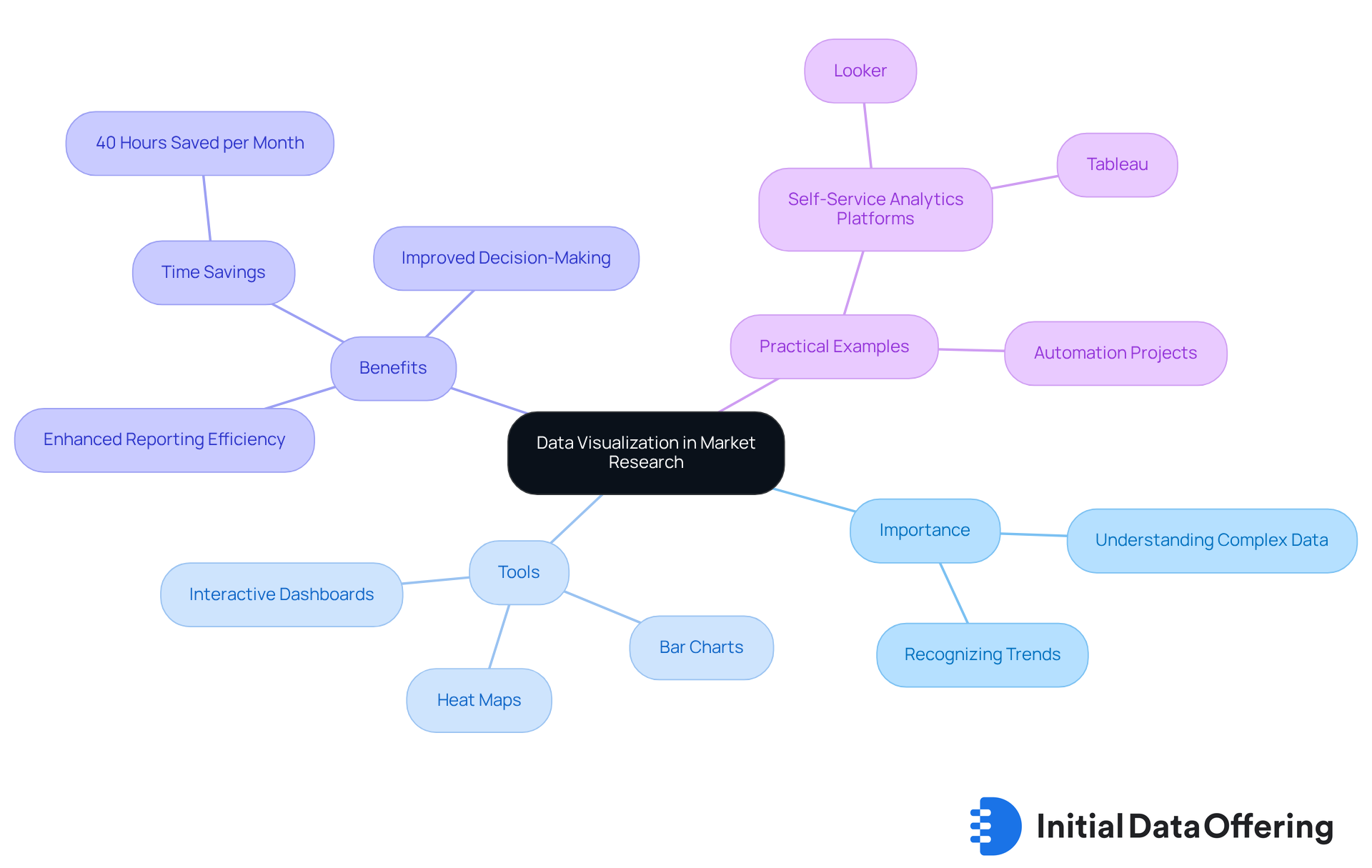
Information portrayal serves as the graphical depiction of insights and facts, utilizing visual components such as charts, graphs, and maps to present intricate datasets in a readily understandable format. In the realm of market analysis, effective information visualization is crucial, enabling stakeholders to swiftly grasp complex information, recognize trends, and make informed choices. For instance, a well-constructed bar chart can illustrate sales trends over time, while a heat map can highlight customer engagement across various regions.
Recent trends indicate a rapid expansion in the volume of business information, leading to increased categorization options and the emergence of numerous datasets. However, without adequate information matching, significant business value can be lost, remaining concealed within fragmented datasets. This underscores the necessity for analysts to utilize a robust that not only displays information but also promotes a deeper understanding.
The advantages of a data visualization tool for graphical depiction are manifold; it enables analysts to merge several information points, facilitating the identification of trends and patterns that may be overlooked in tabular information. For example, organizations that have implemented a data visualization tool with interactive dashboards report saving over 40 hours per month per department, significantly enhancing reporting efficiency and decision-making processes. This time savings can be directly attributed to the clarity and accessibility that effective graphical representation provides, allowing analysts to focus on strategic conclusions rather than manual reporting.
Practical examples further demonstrate the power of visualization. Companies transitioning to self-service analytics platforms, such as Looker, have successfully automated data extraction and developed interactive dashboards with a data visualization tool, resulting in enhanced insights and streamlined information management. This transformation has proven essential for businesses striving to remain competitive in a data-driven landscape, as it facilitates quicker responses to market changes and more informed decision-making.
As Mindaugas Jancis observes, "Without appropriate information matching, much business value is lost between the datasets, forever concealed and forever unrecovered." Moreover, Maryna Chernik highlights that "businesses experience information excess, which can result in the circumstance when significant details stay unnoticed." This emphasizes the essential role that efficient graphical representation plays in ensuring that valuable insights are not only accessible but also actionable. By mastering information display resources, analysts can enhance their narrative skills, ultimately leading to improved results and informed choices throughout their organizations.

Identify Key Features and Criteria for Selecting Data Visualization Tools
When choosing a data visualization tool, it is essential to prioritize several key features to ensure effective data analysis and presentation.
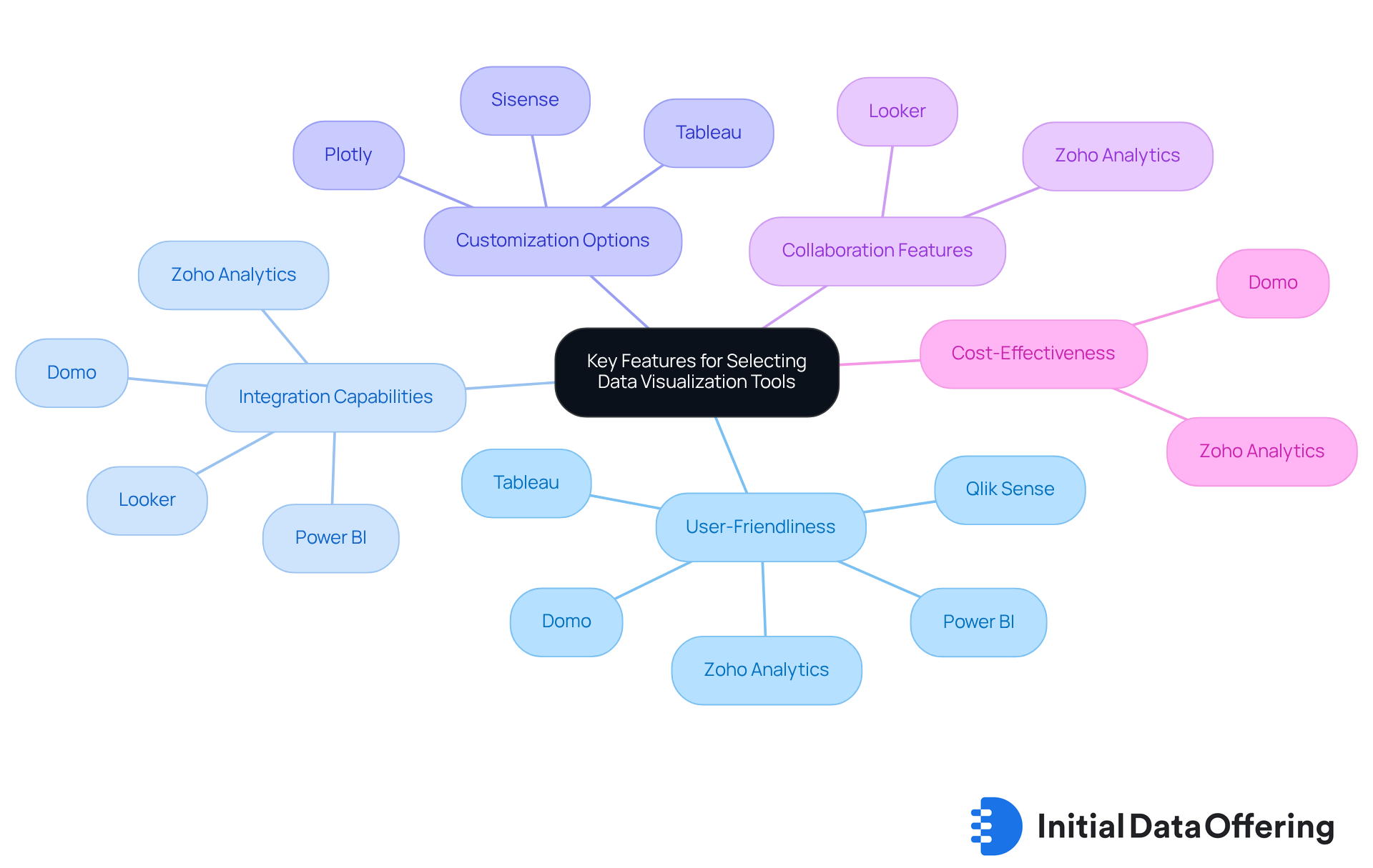
- User-Friendliness: An intuitive interface is crucial in a data visualization tool, allowing users to create visualizations without extensive training. Tools like Domo and Zoho Analytics exemplify this, offering drag-and-drop functionalities that cater to users of varying technical backgrounds. While Plotly is known for its high customization capabilities, it may lack user-friendliness for non-technical users. This highlights the importance of balancing customization with ease of use, ensuring that all users can leverage the tool effectively.
- Integration Capabilities: The integration capabilities of a data visualization tool, particularly the ability to seamlessly combine with existing information sources and analytics platforms, is vital. For example, Power BI works effectively with Microsoft products, while Looker links smoothly with GSuite, improving information sharing and collaboration. Domo also stands out by integrating with over 1,000 data sources, making it a versatile option for diverse data environments, thus enhancing the overall user experience.
- Customization Options: Look for a data visualization tool that offers customizable templates and design options. Sisense and Tableau, for instance, enable users to customize displays for particular audiences, ensuring that findings are conveyed effectively. Plotly further enhances this aspect by offering robust customization features that allow users to meet specific visualization requirements, tailoring their presentations to their unique needs.
- Collaboration Features: A data visualization tool with collaboration features can significantly enhance the research process by facilitating sharing among team members. Looker’s centralized information management and collaboration resources exemplify how effective teamwork can lead to more reliable insights. Furthermore, Zoho Analytics offers collaborative resources that improve teamwork and information exchange, delivering a more extensive perspective on collaboration functionalities, which is essential for driving collective success.
- Cost-Effectiveness: Evaluate the pricing structure of the data visualization tool to ensure it aligns with your budget while still providing the necessary features. Zoho Analytics is noted for its and is tailored for small to medium-sized businesses, making it a suitable choice for organizations with budget constraints, thus ensuring that cost does not hinder effective data visualization.
By identifying these criteria, analysts can simplify their selection process and choose resources that will effectively support their information representation needs. This ultimately leads to improved evidence-based decision-making, empowering organizations to make informed choices based on their data.

Compare Popular Data Visualization Tools for Market Research Applications
Several data visualization tools excel in the field of market research, each providing unique features designed for various analytical needs.
- Tableau: Renowned for its robust analytics capabilities, Tableau enables users to create interactive and shareable dashboards. This data visualization tool excels in handling large collections of information and offers extensive customization options, making it a favorite among professionals in the field. With a significant , Tableau reflects its popularity among analysts, showcasing its effectiveness in delivering actionable insights.
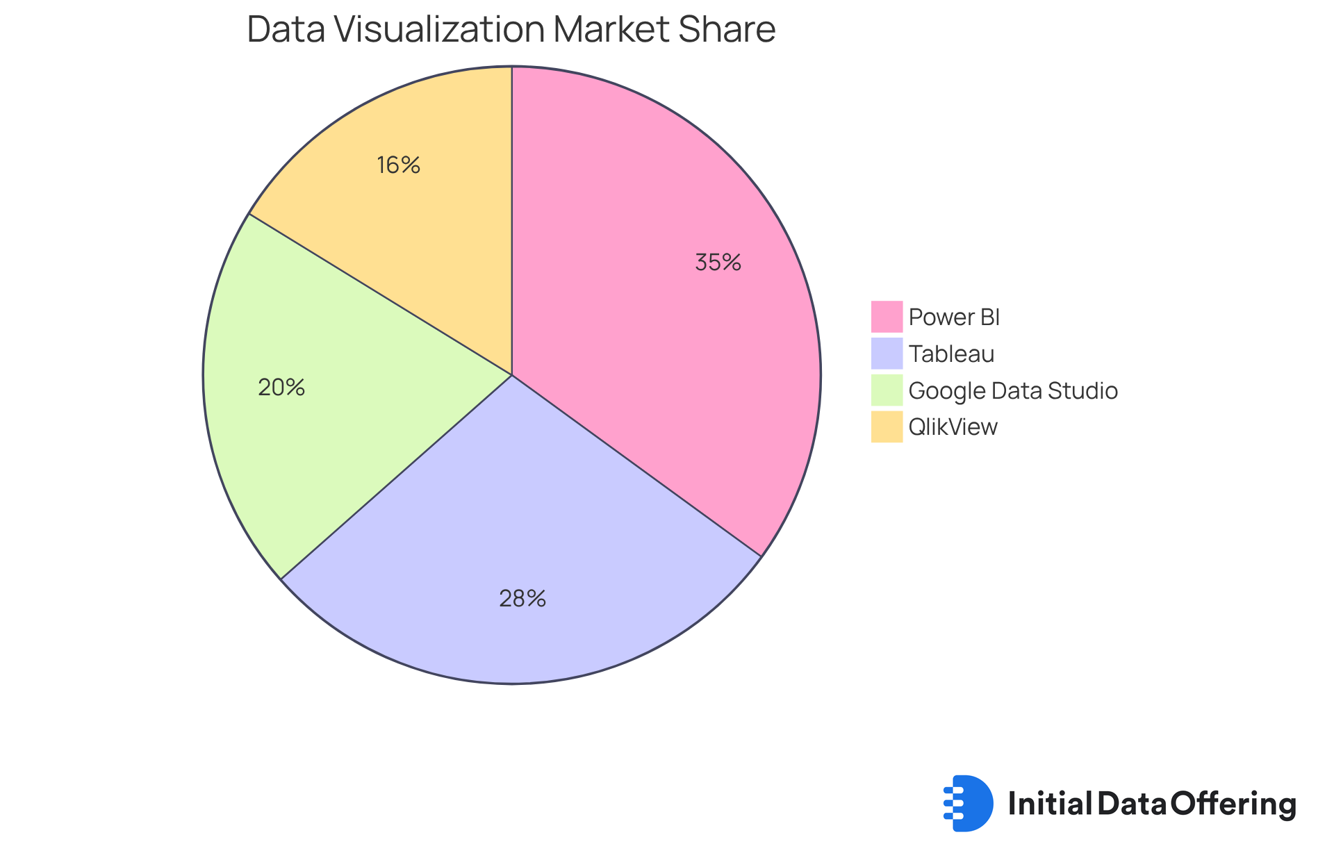
- Power BI: As a Microsoft product, Power BI integrates seamlessly with other Microsoft applications, offering a user-friendly interface and robust modeling features. This integration makes it particularly suitable for organizations already embedded in the Microsoft ecosystem. Experts have observed that Power BI, a leading data visualization tool with a market share of 17.26%, significantly enhances teamwork and organizational efficiency through its collaborative capabilities.
- Google Data Studio: This free tool is ideal for generating reports and dashboards that are easily shareable. Its strong integration with Google services, including Google Analytics, positions it as an excellent choice for teams leveraging these platforms for market analysis. Real-world examples show that teams utilizing a data visualization tool like Google Data Studio have significantly improved their reporting efficiency, making it a practical option for data-driven decision-making.
- QlikView: QlikView stands out with its associative information modeling, allowing users to explore information freely and intuitively. This feature is particularly effective for complex data analysis and offers robust collaboration features, enhancing teamwork in data-driven projects. Analysts have praised QlikView for its flexibility and effectiveness in handling intricate datasets, highlighting its role in fostering a collaborative analytical environment.
By assessing these resources, analysts can determine the most suitable option for their particular market research goals with the help of a data visualization tool. This ensures they utilize the appropriate technology to obtain actionable information. Incorporating insights from industry experts can further guide the selection process, enhancing the overall effectiveness of their analytical efforts.

Implement and Optimize Your Selected Data Visualization Tool
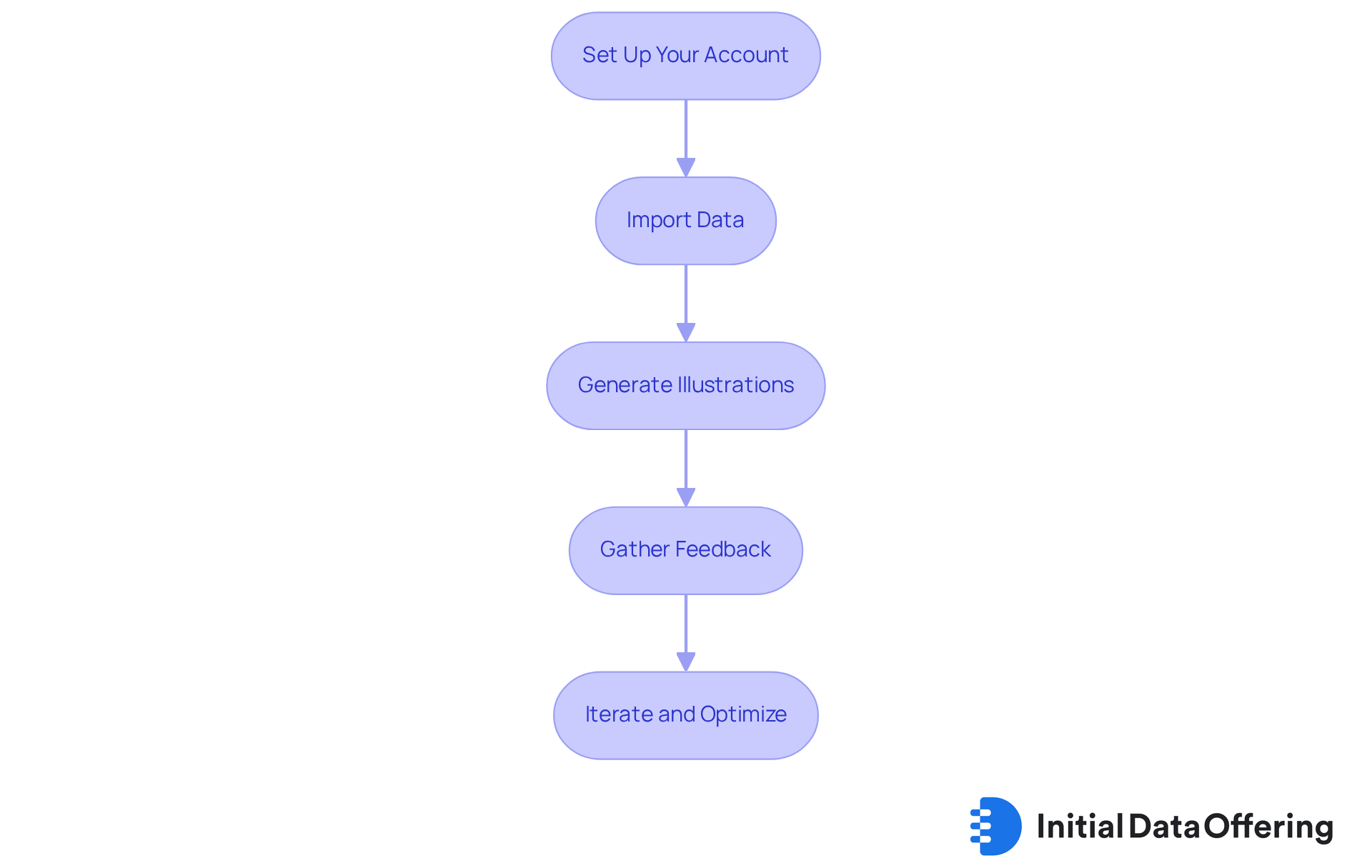
To effectively implement and optimize your chosen data visualization tool, follow these essential steps:
- Set Up Your Account: Begin by establishing an account and navigating the interface to familiarize yourself with its features. As Mindaugas Jancis highlights, selecting an excellent database is crucial for effectively representing information. Therefore, ensure your tool meets your specific requirements.
- Import Data: Upload your datasets, making sure they are clean and well-organized. This organization enables . Remember, the quality of your information directly influences the insights you can derive from it.
- Generate Illustrations: Construct representations that align with your research objectives. Experiment with different chart types to identify which best illustrates your information. According to MarketsandMarkets, the worldwide data representation market is expected to reach USD 12.48 billion by 2028, underscoring the increasing significance of effective representation.
- Gather Feedback: Share your visualizations with colleagues or stakeholders to collect feedback. This step is essential for identifying areas for enhancement and ensuring that your visuals effectively communicate information. Engaging with your audience can help mitigate the risks of information overload, which can obscure crucial insights.
- Iterate and Optimize: Continuously enhance your representations based on the feedback received and any new information. Regularly update your dashboards to reflect the latest insights and trends. With over 70% of enterprises anticipated to adopt data visualization resources by 2025, keeping your visual representations current is crucial for maintaining relevance in your market analysis.
By adhering to these steps, analysts can not only implement their selected tools effectively but also optimize them to significantly enhance their market research outcomes. Real-world examples, such as the successful application of Tableau across various industries, further illustrate the effectiveness of these strategies.

Conclusion
Mastering data visualization tools is pivotal for analysts aiming to transform complex datasets into actionable insights. By harnessing the power of visual representation, stakeholders can swiftly comprehend intricate information, recognize trends, and make informed decisions. This guide underscores the importance of selecting the right data visualization tools and implementing them effectively to enhance market research outcomes.
Key points discussed throughout the article include:
- The significance of user-friendly interfaces
- Integration capabilities
- Customization options
- Collaboration features
- Cost-effectiveness when choosing a data visualization tool
The comparison of popular tools such as Tableau, Power BI, and Google Data Studio illustrates their unique strengths and suitability for various analytical needs. Following a structured implementation process, including feedback collection and continuous optimization, ensures that analysts can maximize the potential of their chosen tools.
Ultimately, the ability to visualize data effectively transcends mere technical skill; it is a critical competency in the ever-evolving landscape of market research. By adopting best practices and leveraging the right tools, organizations can unlock valuable insights, drive better decision-making, and maintain a competitive edge in their respective markets. Embracing these strategies empowers analysts to transform data into a compelling narrative that supports strategic objectives and fosters informed choices across the organization.
Frequently Asked Questions
What is data visualization and why is it important in market research?
Data visualization is the graphical representation of insights and facts using visual elements like charts, graphs, and maps. It is important in market research as it enables stakeholders to quickly understand complex information, recognize trends, and make informed decisions.
What are some common examples of data visualization tools?
Common examples of data visualization tools include bar charts to illustrate sales trends and heat maps to highlight customer engagement across different regions.
How has the volume of business information changed recently?
There has been a rapid expansion in the volume of business information, leading to increased categorization options and the emergence of numerous datasets.
What challenges arise from fragmented datasets?
Significant business value can be lost when there is inadequate information matching, as important insights may remain concealed within fragmented datasets.
What benefits do data visualization tools provide for analysts?
Data visualization tools allow analysts to merge multiple information points, helping to identify trends and patterns that may be missed in tabular data. They also enhance reporting efficiency, saving organizations over 40 hours per month per department.
How do self-service analytics platforms improve data management?
Self-service analytics platforms, such as Looker, automate data extraction and develop interactive dashboards, leading to enhanced insights and streamlined information management.
What impact does effective graphical representation have on businesses?
Effective graphical representation ensures that valuable insights are accessible and actionable, allowing businesses to respond quickly to market changes and make informed decisions.
How can analysts improve their narrative skills through data visualization?
By mastering information display resources, analysts can enhance their narrative skills, leading to improved results and informed choices within their organizations.