10 Free Data Visualization Tools for Market Research Analysts

10 Free Data Visualization Tools for Market Research Analysts
Overview
This article highlights ten free data visualization tools that are especially valuable for market research analysts. Tools like Tableau Public, Google Data Studio, and Microsoft Power BI stand out for their unique features and capabilities.
Features: Each tool offers distinct functionalities that enhance data presentation and analysis. For instance, Tableau Public allows users to create interactive visualizations, while Google Data Studio integrates seamlessly with other Google services. Microsoft Power BI provides robust analytics capabilities, making it a favorite among professionals.
Advantages: These tools simplify the process of transforming complex data into engaging visual formats. By utilizing these platforms, analysts can present their findings more effectively, making it easier for stakeholders to grasp insights quickly.
Benefits: Ultimately, these tools empower analysts to make informed decisions. With the ability to visualize data clearly, they can identify trends and patterns that might otherwise go unnoticed.
How can these tools enhance your market research efforts? Consider the potential impact of using data visualizations to communicate your findings more effectively.
In conclusion, leveraging these free data visualization tools can significantly improve the quality of market research analysis. By adopting these technologies, analysts can not only enhance their presentations but also drive better decision-making processes.
Introduction
In an age where data drives decision-making, market research analysts are increasingly turning to innovative tools that simplify the visualization of complex datasets. This article explores ten free data visualization tools that empower analysts to create compelling visuals, enhance their insights, and ultimately make more informed strategic decisions.
With the rapid evolution of data analytics, the challenge lies in selecting the right tools that not only meet current demands but also adapt to future needs. These tools can transform the way analysts present their findings and engage with their data. How can they enhance your analytical capabilities and improve your decision-making process?
By leveraging these visualization tools, analysts can effectively communicate their insights, making complex data more accessible and understandable. This not only aids in internal discussions but also enhances presentations to stakeholders, fostering a clearer understanding of the data at hand.
Initial Data Offering: Discover Unique Datasets for Enhanced Insights
The Initial Data Offering (IDO) serves as a centralized hub for discovering unique datasets across various fields, including finance, social media, and environmental studies. By meticulously curating high-quality datasets, IDO provides market research analysts with critical information that enhances their insights and informs strategic decisions. This commitment to quality not only enables users to discover the latest information trends but also fosters a collaborative environment where they can share and monetize their datasets.
As the demand for information-driven decision-making continues to rise, the growth of marketplaces for information is projected to reach significant heights by 2025. Many experts emphasize the essential role of centralized hubs like IDO in enhancing analytical insights. How can these distinctive datasets impact your research? By leveraging IDO's offerings, researchers can utilize information more efficiently in their studies, ultimately leading to more informed conclusions and strategies.
In summary, IDO stands out as an essential asset for researchers aiming to harness the power of data. With its focus on quality and community involvement, it not only meets the growing demand for insightful information but also empowers users to take charge of their data-driven decisions.
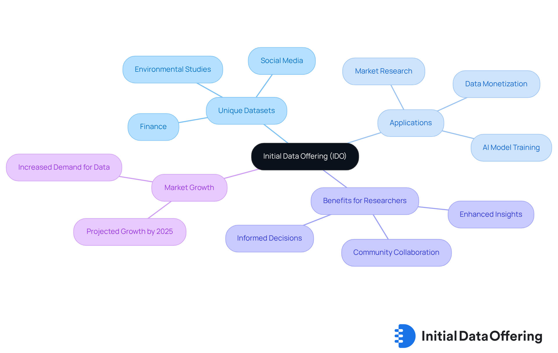
Tableau Public: Create Interactive Visualizations with Ease
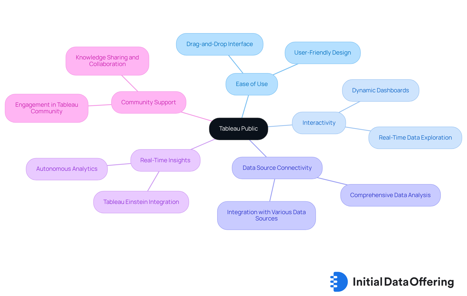
Tableau Public is a powerful platform that offers free data visualization tools, enabling users to create and share interactive visualizations with ease. What makes it stand out for market research professionals in 2025? Its ability to connect seamlessly to various data sources is crucial for comprehensive analysis. The platform features an intuitive drag-and-drop interface, simplifying the dashboard creation process. This ease of use is particularly beneficial for presenting complex information in an engaging way, which enhances the communication of insights.
Moreover, Tableau Public offers interactive dashboards equipped with filters and drop-down menus, significantly boosting viewer engagement. Audiences can explore data in real-time, making the experience more dynamic. Additionally, the integration of Tableau Einstein introduces autonomous and assistive analytics, providing real-time insights that are vital for market research.
As organizations increasingly embrace data-driven decision-making, professionals looking to present their findings effectively can benefit from using free data visualization tools like Tableau Public. The vibrant Tableau community further enriches the user experience, fostering collaboration and knowledge sharing that can elevate the careers of data professionals. How can you leverage these features to enhance your own data presentations?
Google Data Studio: Build Custom Reports and Dashboards
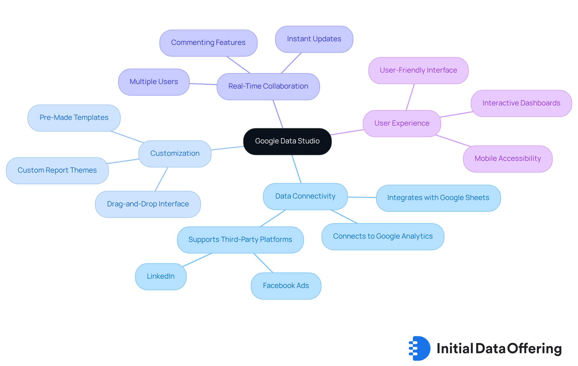
Google Data Studio is one of the powerful free data visualization tools that enables analysts to create customized reports and dashboards. Its key features include the ability to connect to various information sources, such as Google Analytics, Google Sheets, and third-party platforms like Facebook Ads and LinkedIn. This connectivity allows users to visualize their insights effectively. The platform supports a variety of chart types, including time series, bar charts, and geo maps, enhancing the flexibility of visual representation. This adaptability empowers analysts to utilize free data visualization tools to tailor their reports to meet specific business needs, making it a valuable asset for market research.
Current trends highlight a growing emphasis on free data visualization tools that enhance user experience and information accessibility. Google Data Studio exemplifies this trend by offering free data visualization tools and a user-friendly interface that simplifies the report-building process. Analysts can utilize its drag-and-drop features and pre-designed templates to create interactive dashboards that not only showcase information but also narrate engaging stories. How might these features streamline your reporting process?
The integration capabilities of Google Data Studio further amplify its utility. By engaging with multiple platforms, individuals can retrieve real-time information, ensuring that their reports reflect the most recent insights. This dynamic reporting feature is crucial for making informed decisions in fast-paced market environments using free data visualization tools. Additionally, the real-time collaboration features allow multiple users to work on reports simultaneously, enhancing teamwork and efficiency. Consider how this could improve your team's workflow.
Analysts have noted the importance of customization in their reporting processes. As one specialist emphasized, "Google Data Studio enables you to categorize your information into various dashboards and reports, allowing you to effortlessly examine only the details you desire at that moment." This level of customization is essential for addressing specific business inquiries and improving clarity in presentation.
Nevertheless, users may encounter typical obstacles with Google Data Studio, such as complex information integration and sluggish report loading times. Despite these challenges, examples of effective dashboards created with free data visualization tools, such as Google Data Studio, showcase its versatility. From monitoring marketing performance to analyzing engagement metrics, these dashboards offer actionable insights that facilitate strategic decision-making. The platform's capability to integrate information from diverse sources enables thorough analysis, establishing it as a favored option among market research experts. What insights could you gain from utilizing such dashboards in your own work?
Microsoft Power BI: Leverage Powerful Data Visualization Features
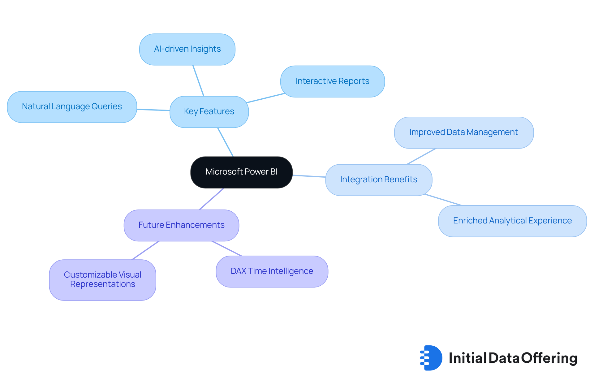
Microsoft Power BI is a powerful analytics platform that provides users with free data visualization tools to visualize data and share insights across their organizations. Its key features include natural language queries and AI-driven insights, which simplify the creation of interactive reports and dashboards. This seamless integration with other Microsoft products enhances usability, making Power BI a favored tool among market research analysts who aim to leverage data effectively.
What advantages does this integration offer? Industry leaders have noted that combining Power BI with tools like Azure Maps and Fabric Notebooks not only improves data management but also enriches the analytical experience. This allows for deeper insights and more informed decision-making. Organizations utilizing free data visualization tools, such as Power BI, have reported enhanced decision-making capabilities, thanks to its dynamic visualizations and real-time data analysis features.
Looking ahead to 2025, Power BI continues to evolve, introducing features tailored specifically for market research professionals. These enhancements include improved DAX time intelligence and customizable visual representations, further solidifying its position as a leader in free data visualization tools. How might these advancements impact your organization's analytical capabilities? By staying updated with these developments, professionals can ensure they are making the most of their data-driven strategies.
Infogram: Design Engaging Infographics and Reports
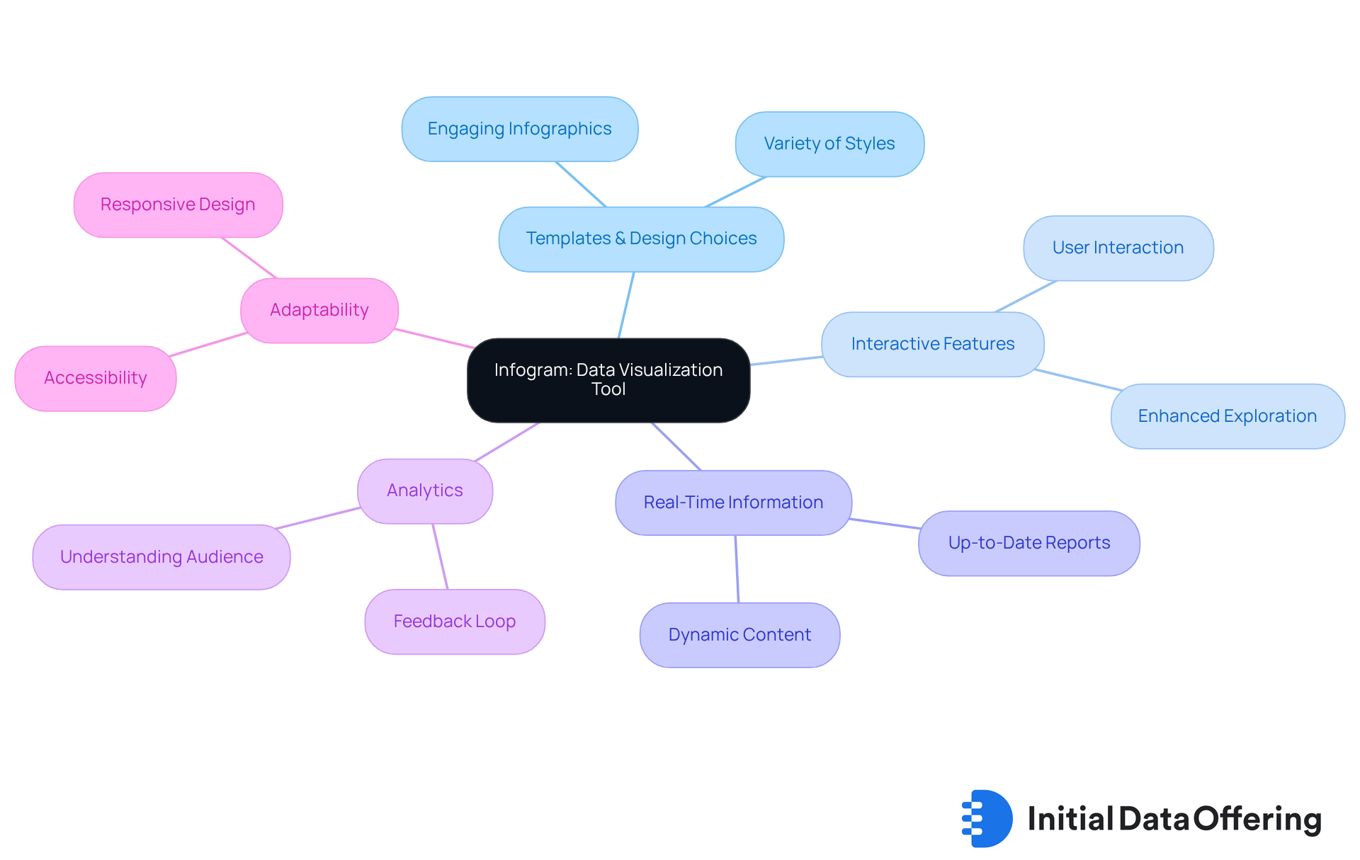
Infogram is a powerful and user-friendly tool that offers free data visualization tools for market research professionals, enabling them to create engaging infographics and reports. What makes it stand out? Its varied selection of templates and design choices allows analysts to transform intricate information into visually appealing formats that not only draw attention but also effectively convey insights.
The platform boasts interactive features, including the ability to add tabs, hover effects, and filters, which enhance exploration and engagement. Why is this important? These features encourage users to interact with the data, making the information more accessible and engaging. Additionally, Infogram's capability to incorporate real-time information ensures that reports remain visually appealing and up-to-date, increasing their relevance in dynamic market contexts.
Moreover, Infogram monitors analytics, enabling users to assess the effectiveness of their visual content through metrics such as clicks, views, and shares. This feedback loop is crucial for refining future projects. How does this benefit professionals? It allows them to understand what resonates with their audience, leading to more impactful presentations.
Every project designed in Infogram automatically adapts for desktop, tablet, and mobile devices, ensuring accessibility across various platforms. This adaptability makes Infogram one of the most valuable free data visualization tools for professionals aiming to present data compellingly, facilitating better understanding and decision-making. In what ways can you leverage Infogram in your work? By utilizing its features, you can enhance your data presentations and drive more informed decisions.
Plotly: Generate Advanced Graphs and Interactive Visualizations
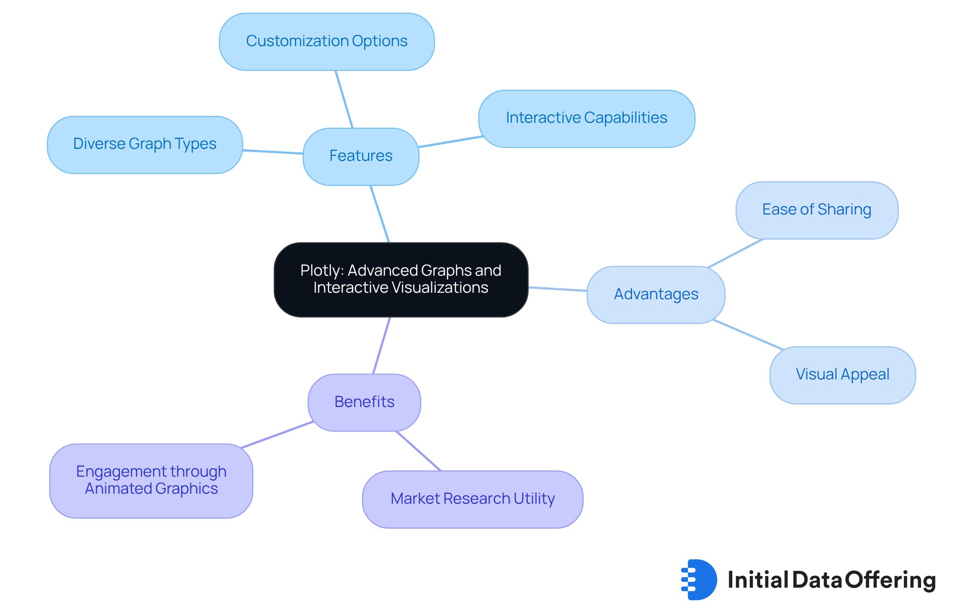
Plotly stands out as a versatile graphing library that empowers users to create interactive, publication-quality visualizations. Features include the ability to generate a diverse array of graphs, from straightforward line charts to intricate 3D plots, all tailored to specific needs. Advantages of this platform lie in its extensive customization options, which enable the creation of visually appealing and informative graphics. Benefits include the ease of sharing these graphics, making Plotly an invaluable resource for market research professionals who aim to present their findings dynamically.
As we look ahead to 2025, the trend towards interactive graphing tools continues to gain momentum. Experts increasingly acknowledge the importance of visual storytelling in presenting information. Brian Julius, an experienced data analyst, emphasizes that "representing information is essential in analytics as it aids individuals in observing extensive volumes of information and deriving significant insights." This highlights the growing reliance on tools like Plotly to facilitate deeper interaction with data.
Interactive graphs generated with Plotly often feature animated visualizations that enhance engagement and understanding. The recent launch of Plotly Studio, which attracted over 6,000 registrants during its early access program, allows users to create visual applications in under two minutes. This significantly simplifies the process of producing impactful presentations. Furthermore, the upcoming "Rise of Vibe Analytics" event on September 23, 2025, showcases Plotly's active engagement in the analytics community. As the demand for engaging information presentations increases, how can professionals leverage Plotly to meet changing market research requirements? Plotly remains at the forefront, providing experts with the tools necessary to adapt.
D3.js: Create Dynamic and Interactive Visualizations
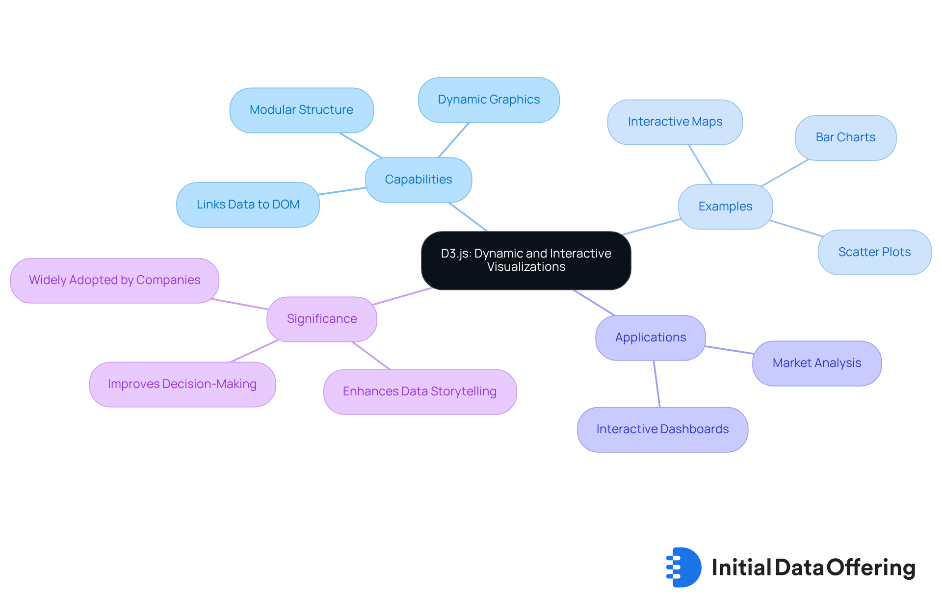
D3.js is a powerful JavaScript library designed for creating dynamic and interactive graphics directly in web browsers. By linking data to the Document Object Model (DOM), professionals can implement information-driven transformations that result in visually engaging graphics tailored to their specific needs. This flexibility positions D3.js as an essential tool for analysts aiming to craft customized representations that effectively communicate their narratives.
As of 2025, D3.js continues to lead trends in JavaScript libraries for data representation, with over 55,995 companies worldwide leveraging its capabilities. The library's modular structure enhances scalability, allowing developers to create complex visualizations that can handle millions of data points while maintaining performance. Analysts can utilize D3.js to develop interactive dashboards that not only display real-time data but also engage users through personalized insights.
Examples of customized displays created with D3.js include:
- Interactive maps that illustrate geographic data
- Bar charts that track market trends
- Scatter plots that reveal relationships between variables
These visualizations are particularly beneficial in market analysis, where understanding complex datasets is crucial for informed decision-making.
As businesses increasingly acknowledge the significance of effective data visualization—72% of companies affirming its necessity—D3.js distinguishes itself by enhancing data storytelling through free data visualization tools. By employing D3.js, researchers can create visualizations that not only inform but also captivate their audience, ultimately leading to improved outcomes in their research efforts. How might you leverage D3.js to enhance your own data presentations?
Datawrapper: Quickly Create Simple Charts and Maps
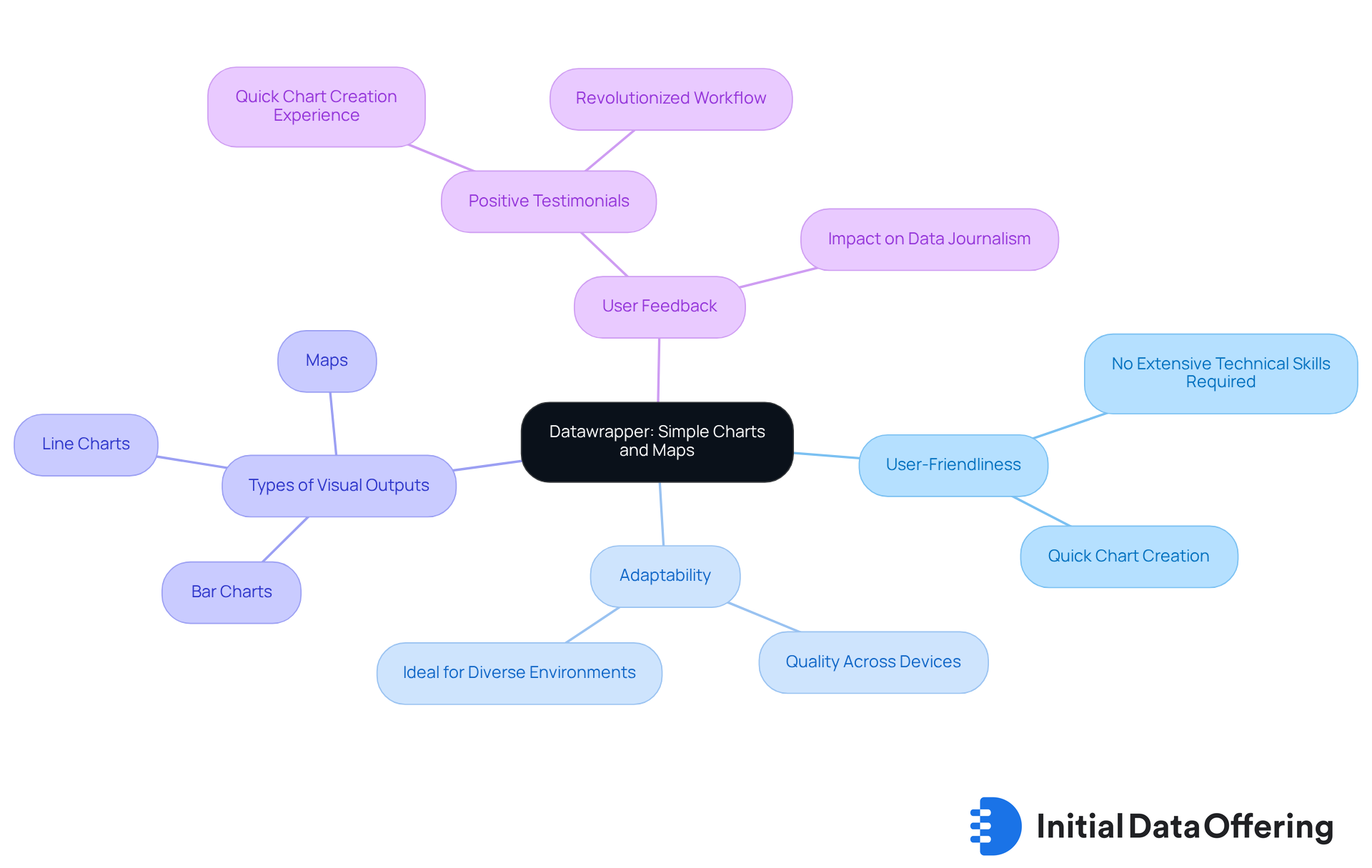
Datawrapper is an accessible online platform designed to empower users in creating simple charts and maps quickly and easily. With user-friendliness as a core priority, it allows market research professionals to produce engaging visual representations without requiring extensive technical skills. The platform's adaptable design ensures that these representations maintain their quality across various devices, making it an ideal choice for professionals who need to showcase information efficiently in diverse environments.
As we look ahead to 2025, the trend toward simplified chart creation tools continues to grow, with Datawrapper leading the way by providing free data visualization tools that enhance the display process. Analysts can swiftly generate a variety of visual outputs, from basic line charts to detailed maps, by utilizing free data visualization tools, significantly improving their ability to communicate insights effectively. How might these tools transform your data presentation?
For example, a market research analyst could use Datawrapper to create a straightforward bar chart that illustrates consumer preferences across different demographics or a locator map that highlights regional sales data. These free data visualization tools not only enhance understanding but also support data-driven decision-making. What insights could you uncover with such tools at your disposal?
User feedback highlights the advantages of Datawrapper's straightforward approach. One expert noted, "Datawrapper enabled me to create many data-driven stories in the years that followed," emphasizing how the tool has revolutionized their workflow. Another user shared, "It took me only a few minutes to create a simple line chart on a topic that was currently in the news. That was a real bright spot at the time." Such testimonials underscore the platform's effectiveness in boosting productivity and clarity in information presentation.
Google Charts: Versatile Charting Options for Analysts
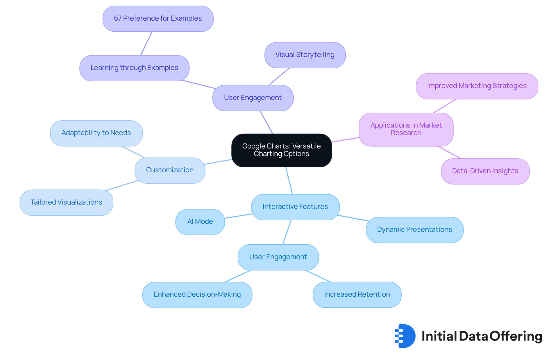
Google Charts is a powerful tool for representing information, offering a wide range of charting options tailored for market research analysts. Its ability to generate interactive charts seamlessly integrates with web applications, enhancing user experience and enabling dynamic presentations of information. Analysts appreciate the versatility of Google Charts, which allows them to customize visualizations based on specific analytical needs. This adaptability is crucial, especially considering that 67% of professionals prefer engaging with examples to develop new visualization skills. Google Charts facilitates this learning process through its interactive features.
Moreover, there is a growing trend toward interactive and user-friendly charting tools, which include free data visualization tools like Google Charts at the forefront. It provides features that meet these evolving demands. For instance, experts can leverage Google Charts to create compelling visual stories that not only convey information but also foster deeper understanding and informed decision-making. The recent introduction of interactive charts in AI Mode for financial data underscores how Google Charts addresses current market needs, solidifying its role as an essential tool for professionals.
How can you utilize Google Charts to enhance your data presentations? By embracing its capabilities, you can transform complex datasets into engaging visuals that resonate with your audience using free data visualization tools. This not only improves comprehension but also empowers stakeholders to make informed choices based on clear, interactive insights.
RAWGraphs: Open-Source Framework for Diverse Visualizations
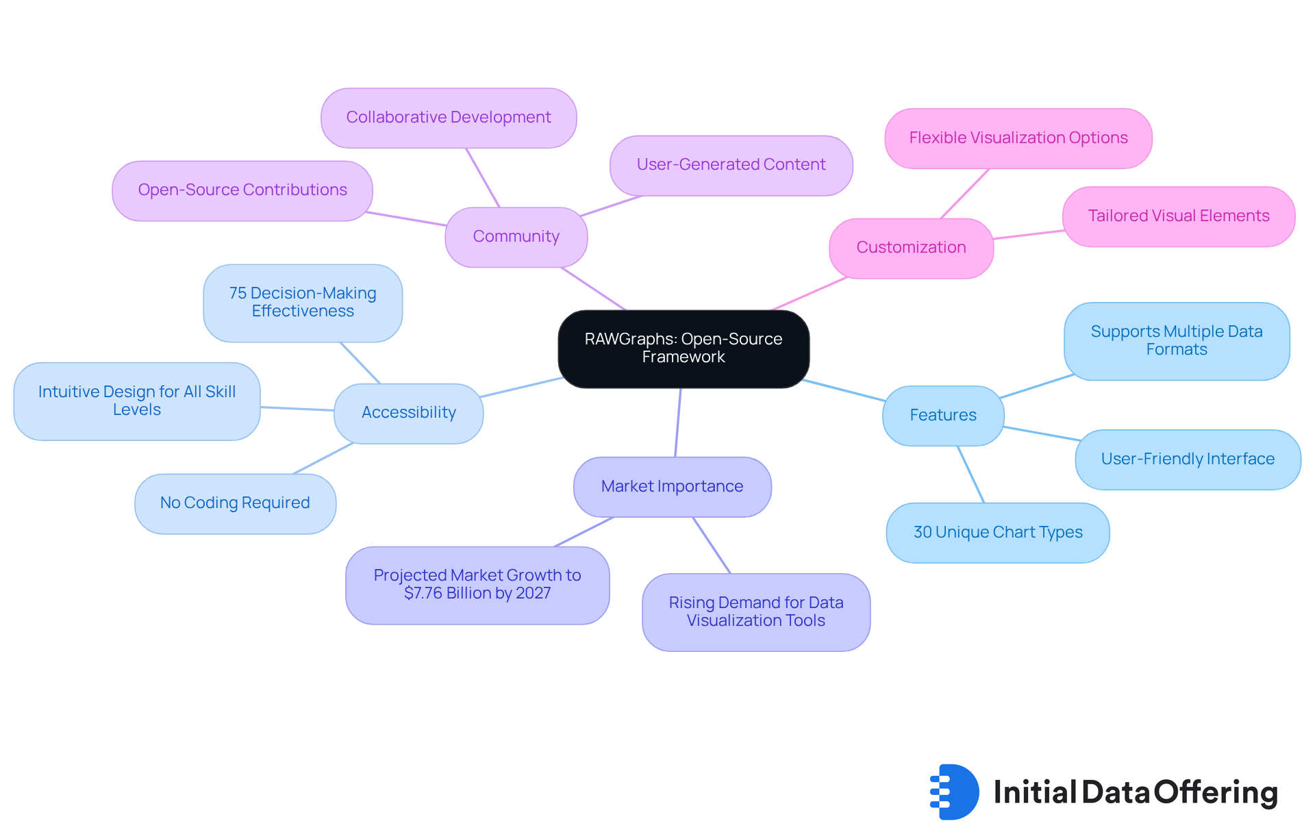
RAWGraphs is one of the powerful free data visualization tools that is an open-source framework designed for illustrating information, allowing users to create a wide array of visuals from their datasets. With nearly 30 unique chart types available—such as bar charts, scatter plots, and chord diagrams—analysts can easily convert complex data into clear, actionable graphics. This user-friendly platform offers free data visualization tools that cater to individuals of all skill levels, enabling the creation of high-quality visuals without the need for extensive coding expertise.
Why is this accessibility important? Studies show that over 75% of effective decision-making hinges on how well information is visually communicated. Furthermore, the global information representation market is projected to reach $7.76 billion by 2027, underscoring the growing demand for tools like RAWGraphs. The platform distinguishes itself by nurturing a collaborative community that enhances its functionality and adaptability, with features aimed at improving teamwork in remote work settings.
The focus on customization and flexibility ensures that analysts can tailor their visualizations using free data visualization tools to meet specific needs. This adaptability makes RAWGraphs an invaluable asset among the free data visualization tools in the ever-evolving landscape of data analysis. How might you leverage such a tool to enhance your own data storytelling? By utilizing RAWGraphs, you can not only improve the clarity of your presentations but also foster better collaboration and understanding within your team.
Conclusion
Exploring free data visualization tools for market research analysts reveals a landscape brimming with opportunities to enhance analytical insights and decision-making. Tools like Tableau Public and D3.js empower professionals to transform complex datasets into engaging visuals, facilitating a better understanding and communication of information. By leveraging these resources, analysts can present their findings more effectively, fostering collaboration and innovation within their teams.
Key insights from the article showcase the diverse functionalities of each tool. For instance:
- Google Data Studio offers seamless integration capabilities.
- Microsoft Power BI boasts powerful analytics features.
- Infogram provides user-friendly design templates, catering to various analytical needs and making data visualization accessible to professionals with different levels of technical expertise.
- The emergence of platforms like RAWGraphs and Datawrapper underscores the trend toward simplifying chart creation and enhancing user experience, enabling analysts to quickly generate impactful visualizations.
As the demand for data-driven decision-making continues to rise, embracing these free data visualization tools is essential for market research professionals. Utilizing these resources not only improves the clarity and effectiveness of presentations but also helps analysts adapt to the evolving landscape of data analysis. The call to action is clear: explore these tools, harness their capabilities, and elevate your data storytelling to drive informed decisions that shape the future of your organization.
Frequently Asked Questions
What is the Initial Data Offering (IDO)?
The Initial Data Offering (IDO) is a centralized hub for discovering unique datasets across various fields such as finance, social media, and environmental studies, aimed at enhancing insights for market research analysts.
How does IDO benefit market research analysts?
IDO provides meticulously curated high-quality datasets that enhance insights and inform strategic decisions, allowing researchers to utilize information more efficiently in their studies.
What is the projected growth of marketplaces for information by 2025?
The demand for information-driven decision-making is expected to lead to significant growth in marketplaces for information by 2025.
What role do centralized hubs like IDO play in research?
Centralized hubs like IDO are essential for enhancing analytical insights, enabling researchers to discover the latest information trends and fostering a collaborative environment for sharing and monetizing datasets.
What is Tableau Public?
Tableau Public is a free data visualization platform that allows users to create and share interactive visualizations easily.
What features make Tableau Public appealing for market research professionals?
Tableau Public offers seamless connectivity to various data sources, an intuitive drag-and-drop interface, interactive dashboards, and integration of autonomous analytics through Tableau Einstein, enhancing the presentation of complex information.
How does Google Data Studio assist analysts in creating reports?
Google Data Studio enables analysts to create customized reports and dashboards by connecting to various data sources and supporting multiple chart types, enhancing the flexibility of visual representation.
What are the advantages of using Google Data Studio?
Google Data Studio offers a user-friendly interface, drag-and-drop features, real-time information integration, and collaborative capabilities, making it a valuable tool for market research.
What challenges might users face with Google Data Studio?
Users may encounter issues such as complex information integration and sluggish report loading times.
Why is customization important in reporting with Google Data Studio?
Customization allows analysts to categorize information into various dashboards and reports, enabling them to focus on specific details relevant to their business inquiries and improving clarity in presentations.