10 Essential Tools for Effective Website Dashboards

10 Essential Tools for Effective Website Dashboards
Overview
The article titled "10 Essential Tools for Effective Website Dashboards" identifies key tools that enhance the functionality and effectiveness of website dashboards. These tools offer significant features, such as data integration from various sources and customizable metrics tailored to specific organizational needs. The advantages of utilizing these tools include improved data visualization and real-time monitoring, which are crucial for effective decision-making in businesses. By implementing these tools, organizations can benefit from enhanced insights that drive informed choices and strategic actions.
Have you considered how these tools could transform your data management processes? With the right dashboard tools, businesses can streamline their operations and gain a competitive edge. The integration of diverse data sources allows for a more comprehensive view of performance metrics, ultimately leading to better outcomes. In conclusion, embracing these essential tools can significantly elevate the capabilities of website dashboards, making them indispensable for modern businesses.
Introduction
In the ever-evolving landscape of digital marketing and data analysis, the significance of effective website dashboards is paramount. Organizations increasingly rely on real-time insights to drive their strategies, making it essential to understand the tools that enhance dashboard functionality.
This article explores ten indispensable tools that empower businesses to create impactful dashboards, streamline decision-making, and foster a data-driven culture.
As data management becomes more complex, how can organizations leverage these tools to visualize their performance and gain a competitive edge in 2025?
Initial Data Offering: Centralized Hub for Quality Datasets
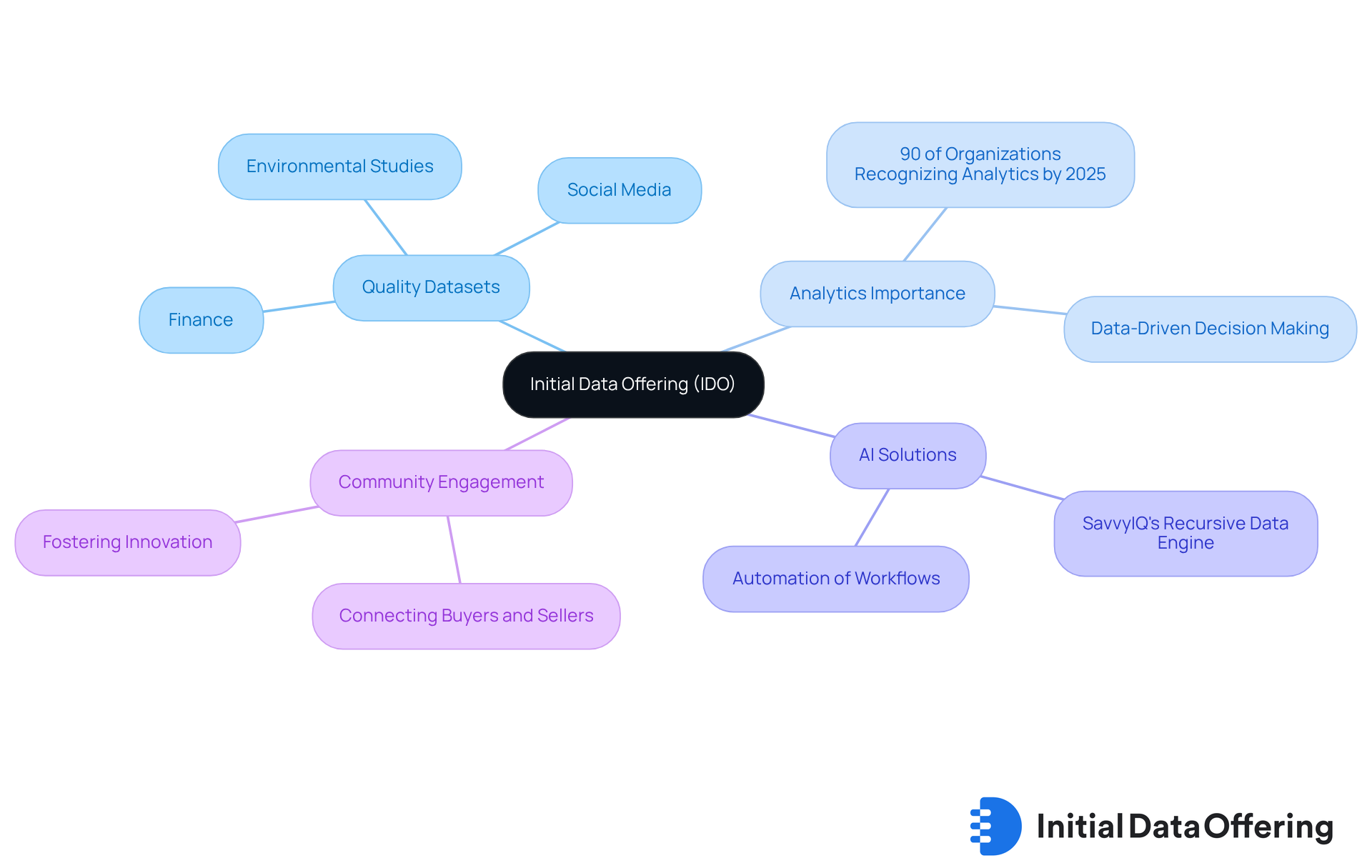
The Initial Data Offering (IDO) serves as a pivotal centralized hub that streamlines the launch and discovery of high-quality datasets. By curating unique collections across diverse fields such as finance, social media, and environmental studies, IDO significantly enhances accessibility for enterprises, researchers, and organizations. This is crucial as, by 2025, it is anticipated that 90% of organizations will recognize the essential role of analytics in informed decision-making. An increasing number of businesses are expected to utilize information marketplaces to drive their strategies.
IDO not only connects information buyers and sellers but also fosters a community committed to quality and innovation. With the utilization of AI-driven solutions like SavvyIQ's Recursive Data Engine, which enhances a dynamic graph of 265 million global entities, IDO empowers individuals to automate workflows and eliminate manual information tasks. Successful platforms illustrate how simplifying dataset launches can enable users to leverage actionable insights, ultimately promoting a data-driven culture.
As industry specialists emphasize, high-quality collections are vital for effective decision-making. This underscores IDO's significance in today's rapidly evolving information landscape. How will your organization adapt to leverage these insights? The emphasis on quality and accessibility provided by IDO not only supports informed decision-making but also positions organizations to thrive in an increasingly data-centric world.
DashThis: Comprehensive Digital Marketing Dashboard Integration
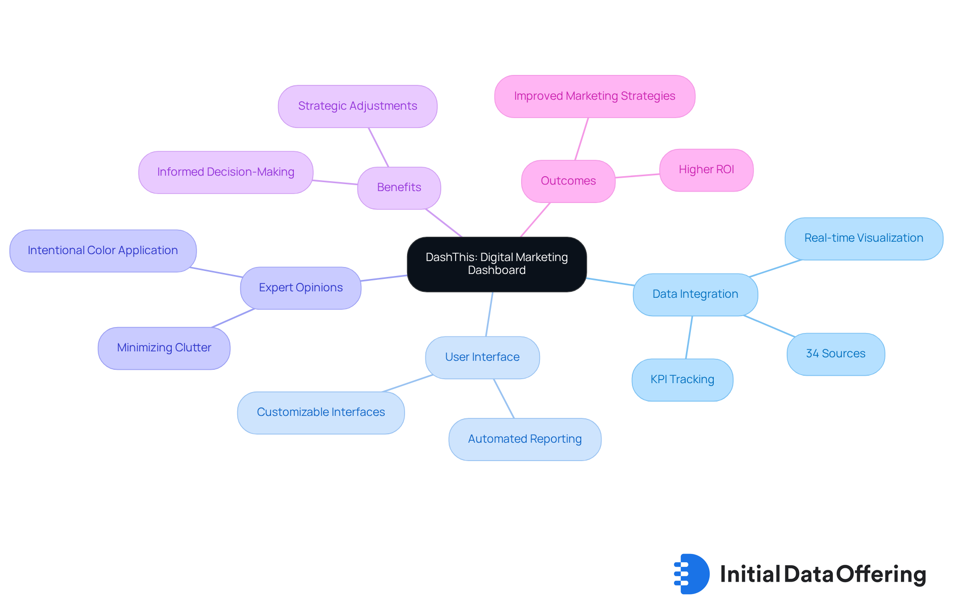
DashThis offers a robust platform for digital marketing professionals, allowing integration of data from over 34 sources, including Google Analytics and various social media platforms. This comprehensive website dashboards enable users to visualize key performance indicators (KPIs) in real-time, which facilitates informed decision-making and strategic adjustments to marketing campaigns. The user-friendly interface and automated reporting features make it a preferred choice for agencies and businesses alike.
Industry experts note that the ability to consolidate data from multiple sources is crucial for effective marketing strategies. This capability enables teams to track performance metrics comprehensively. In 2025, DashThis launched new features that enhance user experience, such as customizable interfaces and advanced visualization tools, further reinforcing its status as a leader in the digital marketing analytics space. Significantly, 28% of local inquiries lead to a purchase, underscoring the importance of effective system integration for driving business outcomes.
Furthermore, industry specialist Nick Desbarats highlights the significance of intentional color application in interface design, stating, "Using color with purpose, not decoration, is important in interface design." Additionally, Alexis Miske suggests removing unnecessary grid lines and busy backgrounds to keep attention focused on the information, which is vital for successful interface design.
DashThis's capability to combine information from various sources enables individuals to develop website dashboards that offer a unified perspective of their marketing performance. This integration improves strategic decision-making skills, allowing professionals to adapt their approaches based on comprehensive insights.
Geckoboard: Best Practices for Dashboard Design
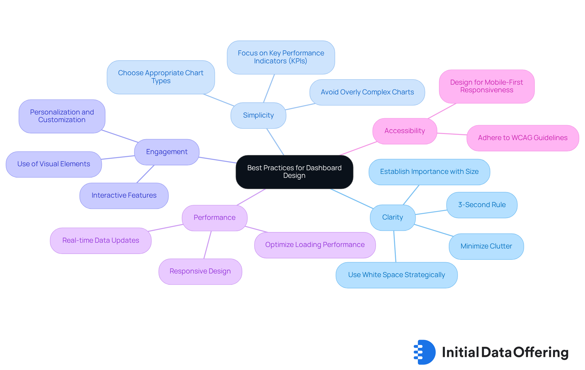
Geckoboard exemplifies optimal display design methods for website dashboards by prioritizing clarity, simplicity, and engagement. The website dashboards' focus on essential metrics minimizes clutter, enabling users to quickly grasp key insights. Research indicates that organizations utilizing visual displays for business intelligence are twice as likely to enhance their decision-making capabilities. By employing visual elements such as graphs and charts, Geckoboard enhances data storytelling through website dashboards, facilitating effective performance tracking and strategic alignment.
As Tiaan Joubert highlights, "The 3-Second Rule is a fundamental principle in effective interface design," underscoring the necessity of instant clarity in presenting key performance indicators. This approach not only improves user comprehension but also fosters a more engaging experience with website dashboards, allowing teams to make informed decisions swiftly.
How can organizations leverage clear and straightforward visual metrics to drive their strategies? As businesses increasingly recognize the importance of effective data representation, Geckoboard stands out as a model for visual clarity in 2025.
Improvado: Essential Web Analytics Metrics for Dashboards
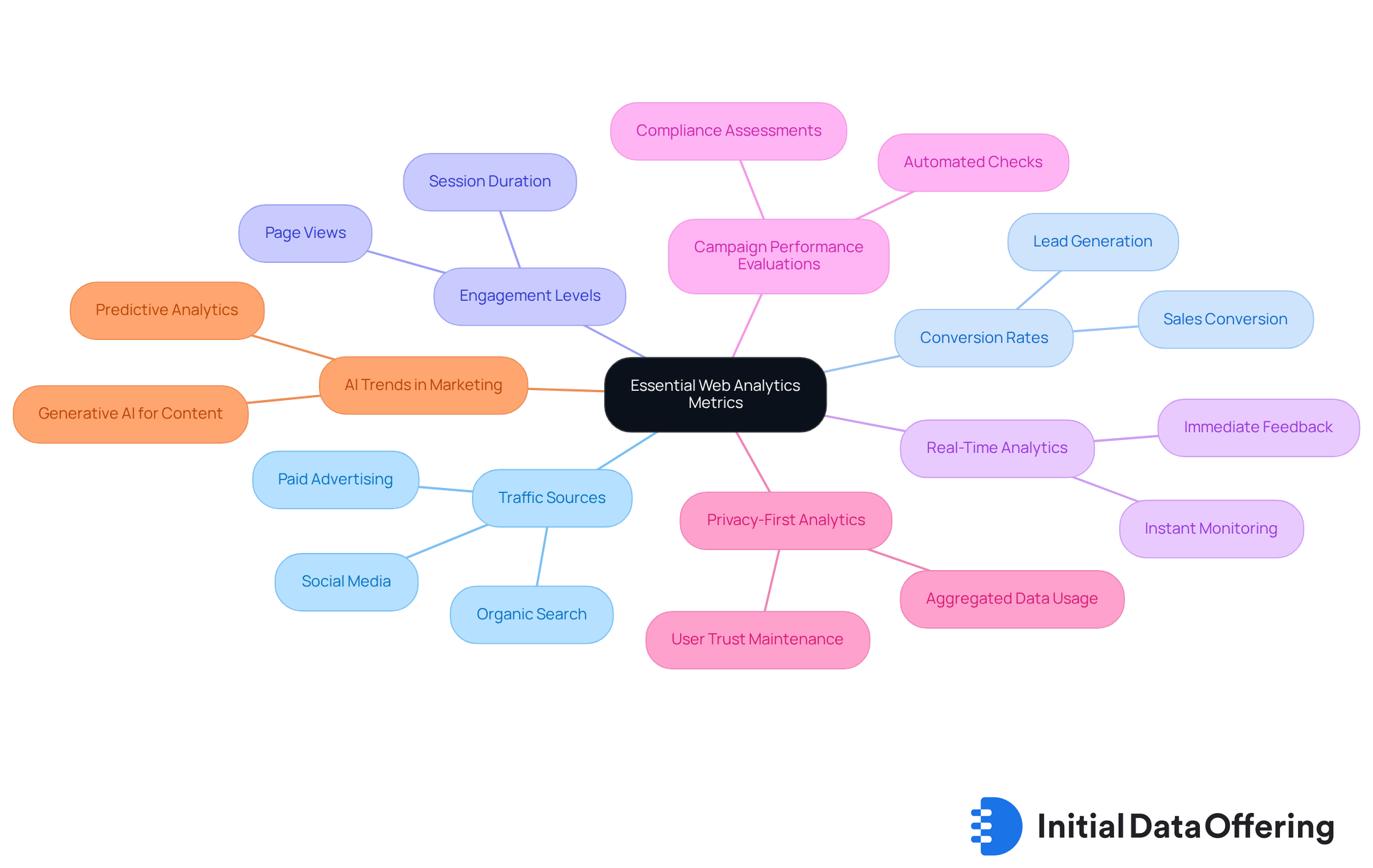
Improvado excels in integrating essential web analytics metrics into website dashboards, allowing organizations to effectively monitor their online performance. Key metrics such as traffic sources, conversion rates, and engagement levels are vital for understanding digital marketing effectiveness in 2025. With real-time analytics capabilities, companies can instantly monitor individual behavior and campaign performance, enabling prompt optimization and timely decision-making. This comprehensive view provided by website dashboards empowers organizations to make data-driven decisions that enhance their digital marketing strategies and improve overall performance.
Notably, Improvado provides over 250 automated campaign performance and compliance evaluations, ensuring that organizations can uphold adherence to regulations such as GDPR and HIPAA while utilizing their analytics. Additionally, privacy-first analytics employs aggregated, anonymized data to maintain user trust, which is increasingly important in today's data-driven landscape. For instance, companies leveraging Improvado have reported significant improvements in their campaign outcomes, with some achieving a reduction in time to insight by 5-10 times. As the landscape of digital marketing evolves, the ability to monitor and analyze these metrics becomes crucial for maintaining a competitive edge.
As Daniel Kravtsov, CEO & Co-Founder of Improvado, notes, "Current trends in AI for marketing automation involve using generative AI for scalable personalized content creation, employing predictive analytics to optimize customer journeys." This emphasizes the necessity for enterprises to adapt to these innovations and continually enhance their analytics strategies. How can your organization leverage these insights to improve your marketing effectiveness?
Klipfolio: Customizable Dashboard Types for Business Needs
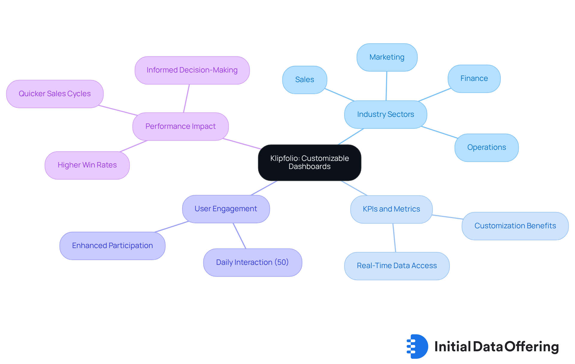
Klipfolio offers a diverse range of customizable website dashboards designed to meet the unique needs of various industry sectors, including sales, marketing, finance, and operations. This feature allows users to create website dashboards that align with their specific KPIs and metrics, ensuring that the data displayed remains relevant and actionable. The advantage of having tailored interfaces, such as website dashboards, is significant; according to industry insights, enterprises that implement these customized solutions experience quicker sales cycles and higher win rates. This highlights the profound impact that personalization can have on overall performance through website dashboards.
The platform's user-friendly drag-and-drop interface simplifies the customization process for website dashboards, allowing teams to concentrate on their primary objectives. With 50% of individuals engaging with website dashboards daily, this level of customization not only enhances participant involvement but also significantly influences overall organizational performance by facilitating informed decision-making. Furthermore, the latest features launched in 2025, including an improved mobile experience and additional editing options for interfaces, further assist businesses in achieving their goals.
How can your organization leverage these customizable website dashboards to improve performance and engagement?
Microsoft Office: Dashboard Creation Tools for Users
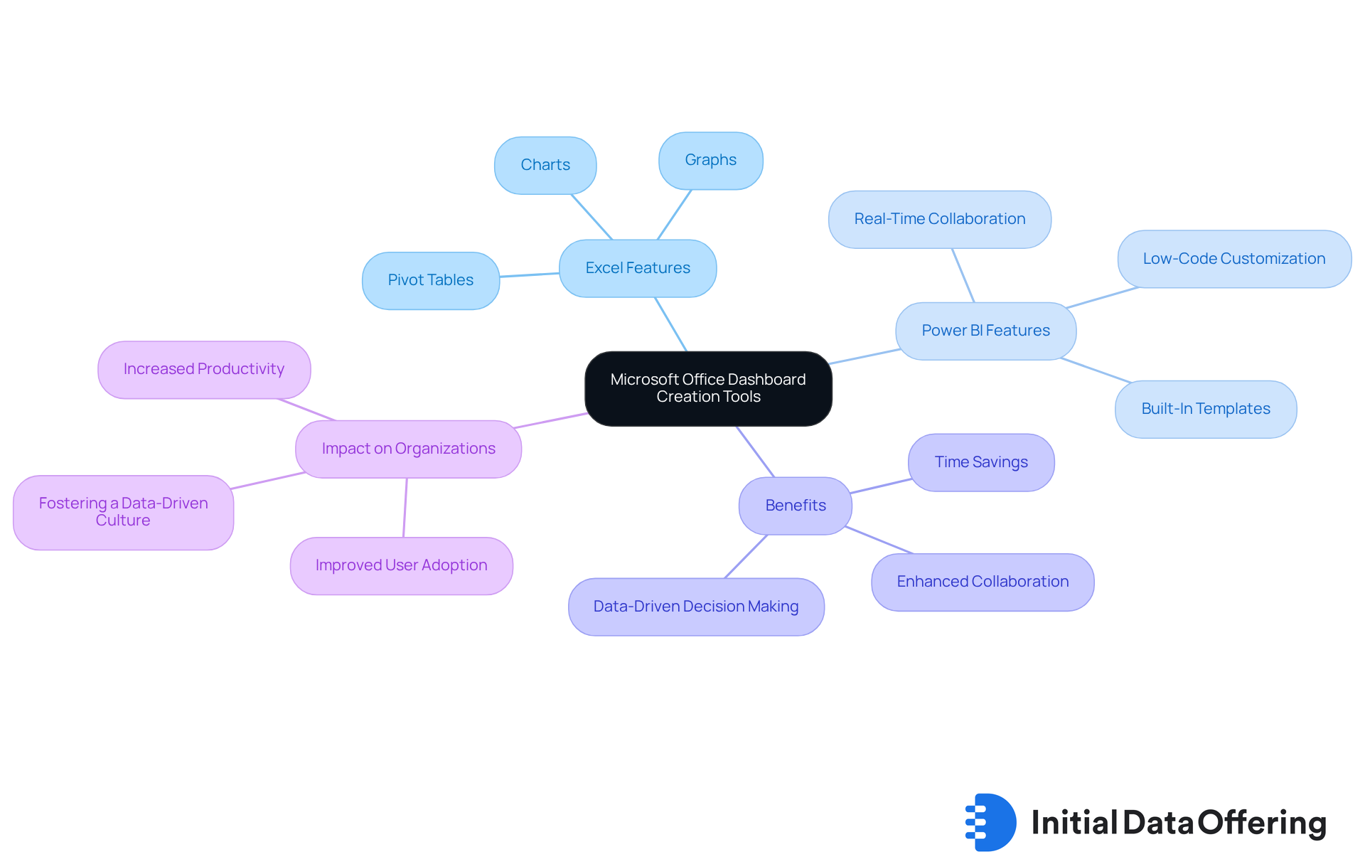
Microsoft Office equips individuals with powerful resources for creating visual displays, particularly through Excel and Power BI. These applications offer efficient data visualization using a variety of charts, graphs, and pivot tables, which facilitate the examination of trends and performance metrics. In 2025, Power BI continues to enhance its display features, incorporating real-time collaboration and low-code customization. This evolution significantly streamlines the development process, allowing users to create reports more effectively.
Companies leveraging these tools report substantial time savings. For instance, users have noted that utilizing Power BI can reduce the time needed for report creation by as much as 50% compared to traditional methods like Excel. With built-in templates and intuitive interfaces, Microsoft Office tools empower users to develop professional dashboards that enhance collaboration and decision-making across teams.
Data experts praise the efficiency of these tools, highlighting their ability to transform complex information into actionable insights. This capability fosters a culture of analytics within organizations, encouraging data-driven decision-making. As Power BI celebrates its 10th anniversary, its commitment to continuous improvement ensures that users have access to the latest advancements in data visualization technology.
How might these developments impact your organization's approach to data analysis and reporting?
UXCam: User Experience Dashboards for Enhanced Insights
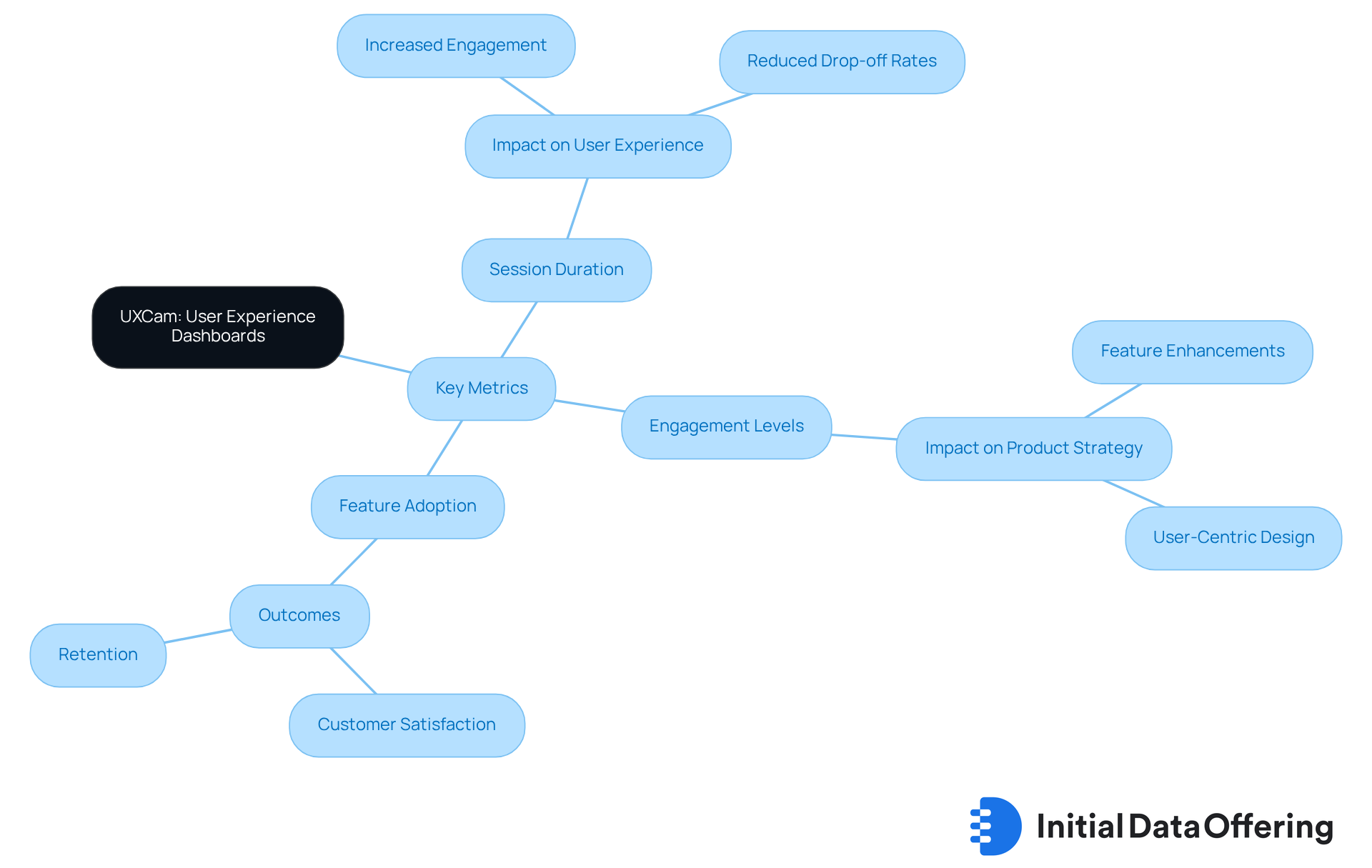
UXCam specializes in delivering experience dashboards that offer valuable insights into user interactions with applications. By monitoring key metrics such as session duration, engagement levels, and feature adoption, UXCam enables companies to identify pain points and refine their interfaces. This focus on user experience not only enhances customer satisfaction but also drives retention, positioning UXCam as an indispensable tool for product teams.
How can understanding these metrics transform your product strategy? By leveraging the insights provided by UXCam, teams can make informed decisions that lead to improved user experiences. For instance, identifying features that are underutilized can prompt targeted enhancements, ultimately fostering greater user engagement.
In summary, UXCam's dashboards serve as a critical resource for companies aiming to optimize their applications. The actionable insights derived from user data empower product teams to create interfaces that resonate with users, thereby boosting satisfaction and loyalty.
Whatagraph: Customizable Dashboards for Tracking Online Performance
Whatagraph provides highly customizable displays that empower businesses to effectively monitor their online performance across various channels. This platform allows users to seamlessly integrate data from over 55 sources, tailoring their dashboards to highlight the most relevant metrics. Such adaptability not only facilitates real-time performance monitoring via website dashboards but also enables teams to derive actionable insights that significantly enhance their marketing strategies.
Moreover, Whatagraph generates clear, client-friendly performance summaries in 18 languages, ensuring that users can communicate insights effectively across diverse audiences. Consequently, businesses leveraging Whatagraph can monitor an average of 5 to 10 channels simultaneously, optimizing their approach to data-driven decision-making.
Trusted by over 1,000 agencies globally, Whatagraph is poised to further enhance its capabilities with the launch of Whatagraph IQ on July 9th, 2025, which will include features like Goals & Alerts to help agencies proactively set performance goals.
![]()
ArcGIS: Insights into Various Dashboard Types
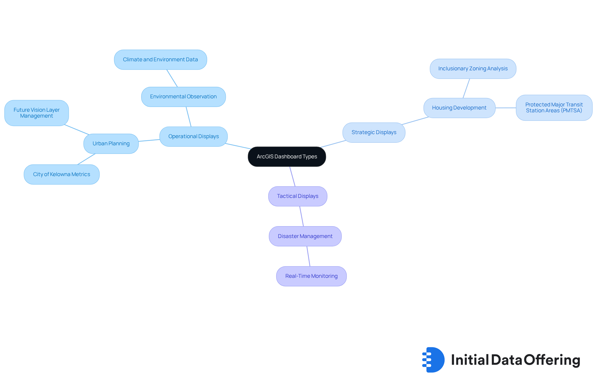
ArcGIS offers a diverse range of visualization types specifically designed for geographic information, encompassing operational, strategic, and tactical displays. These tools enable users to monitor real-time information, analyze trends, and extract actionable insights from geographic details. By seamlessly integrating maps with spatial information, ArcGIS displays provide a comprehensive view that is essential for domains such as urban planning, environmental observation, and disaster management.
In 2025, the significance of geographic data visualization continues to escalate, empowering planners and decision-makers to effectively visualize complex datasets. For instance, the City of Kelowna employs ArcGIS interfaces to showcase vital metrics related to population, housing, and transportation, facilitating informed planning and development strategies. Similarly, the City of Hamilton utilizes these tools to explore redevelopment opportunities, particularly through frameworks like Protected Major Transit Station Areas (PMTSA) and Inclusionary Zoning, underscoring their critical role in addressing housing development challenges.
As Patrick Brennan notes, the increasing reliance on visual displays for decision-making underscores the need for resilience and transparency in data connections, emphasizing the growing importance of these tools in urban planning and environmental management. Furthermore, the October 2025 update of website dashboards in ArcGIS introduces enhancements that elevate user experience and functionality, further solidifying their role in effective decision-making.
LinkedIn Pulse: Key Features and Benefits of Website Dashboards
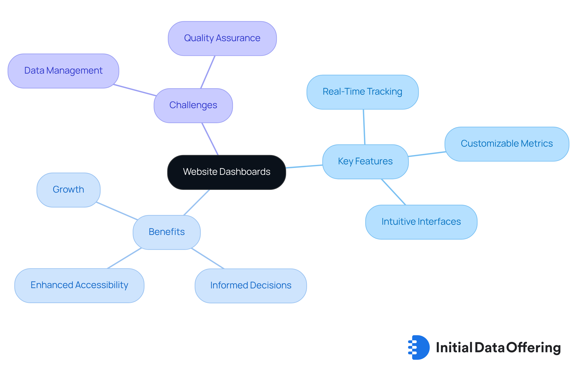
LinkedIn Pulse emphasizes the crucial role of website interfaces in delivering vital insights into online performance. These website dashboards feature real-time information tracking, customizable metrics, and intuitive interfaces, significantly enhancing accessibility. By utilizing these tools, companies can effectively monitor website dashboards, analyze engagement metrics, and make informed, data-driven decisions that foster growth and enhance user experience.
In 2025, the demand for real-time information tracking is paramount. Organizations increasingly rely on immediate insights to adapt strategies and optimize operations. As highlighted by industry experts, the ability to access new information is essential for sustaining a competitive advantage. This capability allows businesses to react swiftly to market shifts and user behaviors. As one expert aptly stated, "Data is like bread—it’s great when fresh, disappointing when stale, and downright dangerous when moldy."
However, organizations face challenges in executing real-time information tracking, such as managing large volumes of data and ensuring quality. For instance, a pharmaceutical company employed a monitoring tool that refreshed every 30 seconds, enabling sales teams to interact with doctors in real time. This demonstrates the practical application of these concepts. Yet, reliance on outdated data can lead to significant risks, underscoring the necessity for continuous data refreshment to maintain the relevance of website dashboards.
Conclusion
The exploration of essential tools for effective website dashboards underscores the transformative power of data visualization in driving informed decision-making. By leveraging platforms such as IDO, DashThis, and Geckoboard, organizations can create cohesive and insightful dashboards that streamline data access and enhance strategic agility in a rapidly evolving digital landscape.
Key insights from various tools highlight the necessity of integrating high-quality datasets and customizable features tailored to specific business needs. For instance, the importance of real-time analytics in Improvado complements the user-centric design principles advocated by Geckoboard. Each tool offers unique functionalities that empower users to monitor performance metrics effectively. Furthermore, advancements in platforms like Microsoft Office and Whatagraph illustrate how organizations can enhance collaboration and engagement through intuitive dashboard creation.
In conclusion, the significance of utilizing effective website dashboards is paramount. As businesses increasingly recognize the value of data-driven insights, embracing these tools fosters a culture of analytics and positions organizations to thrive in a competitive environment. The call to action is clear: leverage these essential tools to transform data into actionable insights, ensuring sustained growth and success in the data-centric world of 2025.
Frequently Asked Questions
What is the Initial Data Offering (IDO)?
The Initial Data Offering (IDO) is a centralized hub that streamlines the launch and discovery of high-quality datasets across various fields such as finance, social media, and environmental studies.
How does IDO enhance accessibility for organizations?
IDO curates unique collections of datasets, making them more accessible for enterprises, researchers, and organizations, which is crucial for informed decision-making as analytics becomes increasingly recognized as essential.
What role does AI play in the IDO?
IDO utilizes AI-driven solutions like SavvyIQ's Recursive Data Engine to enhance a dynamic graph of 265 million global entities, enabling individuals to automate workflows and reduce manual information tasks.
Why are high-quality datasets important?
High-quality datasets are vital for effective decision-making, underscoring IDO's significance in the rapidly evolving information landscape.
What is DashThis and what does it offer?
DashThis is a digital marketing dashboard platform that integrates data from over 34 sources, including Google Analytics and social media platforms, allowing users to visualize key performance indicators (KPIs) in real-time.
How does DashThis facilitate decision-making?
By consolidating data from multiple sources, DashThis enables teams to track performance metrics comprehensively, which facilitates informed decision-making and strategic adjustments to marketing campaigns.
What new features were launched by DashThis in 2025?
DashThis launched new features that enhance user experience, including customizable interfaces and advanced visualization tools.
What design principles does Geckoboard emphasize for dashboards?
Geckoboard prioritizes clarity, simplicity, and engagement in dashboard design, focusing on essential metrics to minimize clutter and enhance user comprehension.
How does visual display impact decision-making?
Research indicates that organizations using visual displays for business intelligence are twice as likely to enhance their decision-making capabilities.
What is the "3-Second Rule" in interface design?
The "3-Second Rule" emphasizes the necessity of instant clarity in presenting key performance indicators, improving user comprehension and fostering an engaging experience with dashboards.